Get Back | What’s the Deal with the Picture & Sound?
Are critics overreacting to Peter Jackson’s handling of the original 16mm footage for his Beatles documentary?
by Dennis Burger
December 12, 2021
I’d seen a lot of complaints on social media about the look of Peter Jackson’s The Beatles: Get Back before I had a chance to dip in myself. Some have grumbled about the image being too soft; others have bemoaned an overly sharp look. I’ve seen Jackson accused of going too far with the color correction and alternately lambasted for not going far enough. And all of this frankly made it a bit difficult to analyze the imagery objectively and report strictly based on what my eyes are telling me.
What my eyes are telling me is . . . well, I can understand where all the inconsistent impressions are coming from because this is one seriously inconsistent image. But, oddly, I think that comes from Jackson trying to impose consistency on it with an iron fist and coming up short.
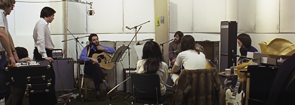
It helps to remember that 16mm film can be highly variable in terms of grain, depending on light levels and other environmental conditions. No doubt, if you were to dig through the dozens of hours of original footage shot for this project, you’d see that no two angles present with the same level of grain. So, what I think is going on is that Jackson applied more digital noise reduction to the grainiest imagery and applied a lighter touch with the “cleaner” footage.
When you look at, for example, the studio segments at Twickenham, one camera angle will show a nice, light grain structure and reasonable detail for 16mm whereas the next will be waxy, overly crisp, and devoid of any real analog qualities at all due to the heavy-handed application of digital noise reduction and A.I. upscaling. Softer background elements jump and wobble unnaturally. Faces have a lot of detail but not a lot of fine detail and nearly no texture. It looks like egregiously grainy footage that has been cleaned up a little too much and processed too aggressively in an attempt to restore some of the detail lost in the scrubbing. But then the next shot will look perfectly natural and undeniably photochemical, if perhaps ever-so-slightly too clean given the source. Unfortunately, though, the former is far more common than the latter.
The long and short of it is that Jackson had to have some metric to use as a target in trying to make the documentary series gel, visually speaking. But in apparently choosing the level of noise as his yardstick, he created a picture that sometimes looks perfectly fine, if a little soft (or a lot soft in out-of-focus shots), and sometimes ventures deep into Uncanny Valley territory, what with its unmistakable stench of pristine artificiality.
Things are quite a bit better in the rooftop concert in the third episode, which is presented in its entirety and is an absolute treasure as a historical document. My only beef with that footage is that it appears there’s been a bit of high-pass filtering done to sharpen the edges in places, but that’s really only blatantly noticeable in the mosaic shots, as long as you’re not too close to the screen.
Overall, that’s a good indicator of how much you’ll be bothered by these inconsistencies and oversteps. At 45-ish degrees field of view (i.e., my 75-inch screen viewed from 6.5 feet away), I found the restoration work mostly good and only occasionally distracting. At closer to 55 degrees (say, a 120-inch screen viewed from 8.5 feet), I found the too-scrubbed and too-sharpened imagery a lot more off-putting. Backing up to where the image took up approximately 33 degrees of my field of view (comparable to a 65-inch screen viewed from 8 feet), it all looked astonishingly good.
The one thing that remained consistent no matter how far away I was from the screen, though, was the exceptional colors of Disney+’s Dolby Vision presentation, which are substantially subtler and more natural than a quick spot-check of the series with HDR disabled. I know Jackson has been accused of going too far here but I don’t think that’s the case. To get a better sense of how much tinkering he did, I found a scan of the original 16mm film, brought it into my photo-editing software, and tweaked it until I got the image as close as possible to the colors I saw on my screen. In the end, my modifications amounted to a very gentle white-balance color correction (far less than I would do on my own photography) and an increase in brightness of around 6 percent. Those minor adjustments made the color locked in those 16mm negatives absolutely pop. I would have been happier to see Jackson take as subtle an approach in cleaning up the grain and upconverting the picture for 4K displays, but it is what it is.
drag the divider to compare the images
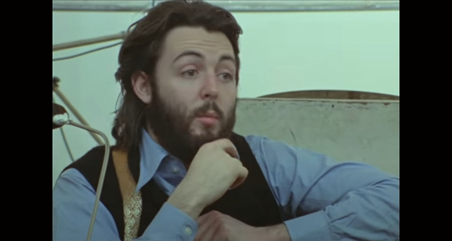
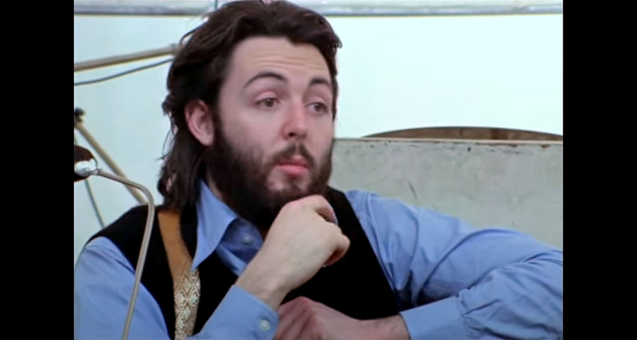
above a scan of the original 16mm film (left) white-balanced & brightened (right)
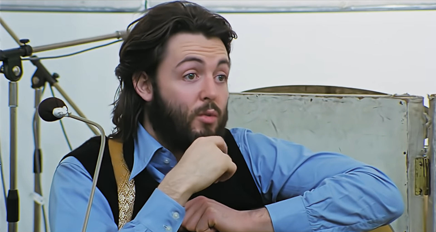
below an 8-bit still from Get Back
Thankfully, he did show some restraint in remixing the original sound into Dolby Atmos. Much of the discussion about the audio restoration has revolved around the technology Jackson and his team developed to isolate individual elements of the tapes—each player’s voice, the guitars, bass, drums, etc.—so the sound could actually be mixed to begin with. Not a lot has been said about the fact that having these discrete stems could have allowed the filmmakers to get a bit too aggressive with the surround sound. Thankfully, they didn’t. If you’re not paying close attention, you might not even realize that the surround channels are doing much of anything for most of the series (aside from the rooftop concert and a flashback here and there sourced from older live recordings), but they are. The height channels don’t have much to do, so the track is predominantly Atmos in name only. But still, the expanded soundscape gives the audio more depth and space without creating the sorts of distractions that unfortunately often detract from the visual presentation.
Dennis Burger is an avid Star Wars scholar, Tolkien fanatic, and Corvette enthusiast who somehow also manages to find time for technological passions including high-end audio, home automation, and video gaming. He lives in the armpit of Alabama with his wife Bethany and their four-legged child Bruno, a 75-pound American Staffordshire Terrier who thinks he’s a Pomeranian.
© 2025 Cineluxe LLC