review | Citizen Kane
Perhaps the most innovative and audacious movie ever makes the move to 4K
by Michael Gaughn
March 21, 2022
No matter how you slice it, a 4K HDR release of Citizen Kane is a big deal. Whether or not you agree that it’s the greatest American film, it is undeniably a hugely important one, and its leap to UHD is inevitably to going draw more attention than it would for most other movies.
So let’s get this out of the way: If you come to this expecting an audio/video experience that’s significantly better than has been delivered on the earlier home releases of Kane, you’re going to be disappointed. If you’re approaching Kane for the first time and are expecting the 4K to help sell you on the film, it likely won’t. And if you’re skeptical of Kane and its reputation, this release could very well help shore up your biases.
That’s not to say you shouldn’t check it out—you should; but just don’t expect the picture or sound to be any kind of tremendously revelatory experience. Adjust your expectations accordingly. There are revelations here, but they’re mostly reserved for attentive viewers already familiar with the film who are willing to tolerate some pretty erratic fluctuations in the presentation. For them, it will be the first home release that even hints at what Kane was like when it was released in May 1941.
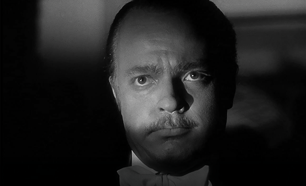
The good stuff first: There are certain shots—typically medium shots and closeups —that have a subtle gradation and a luminous quality that suggest what Kane looked like when the first prints were struck. Since the original negative is lost, it will never be possible to confirm that conjecture but, if true, it suggests that Orson Welles and cinematographer Greg Toland were going for a much more nuanced look than was usually found in Hollywood films. And, if true, it was likely a (successful) effort to give Kane a quiet emotional resonance, to help temper the often blind and sometimes brutal actions of its lead character.
Taking in those shots, and then imagining that look applied to the whole film, Kane becomes a different experience—one very similar to my recent encounter with the 4K HDR release of A Clockwork Orange, which had never felt right in any of its earlier home releases. Orange is a nasty film, but Kubrick never meant for it to be that relentlessly nasty, and seeing the cinematography finally done right gave it wit and verve, restoring the original aesthetic balance.
Certain shots in Kane have a startling depth and subtlety very much reminiscent of what Alfred Stieglitz was able to achieve with the platinum prints of his photos. (See, for instance, the shots listed in the “Reference Images” sidebar.) Little of the rest of Kane in this 4K release—and none of Kane in the earlier home releases—looks much like this, and it’s hard to know how many of those deviations in the look, sometimes extreme, are attributable to having to make up for the lost negative, for the elaborate compositing and optical printing used in many of the shots, or other factors.
All of the above might sound like esoterica—it’s not. If Kane was meant to have a look more toward those tighter shots I cited, then we’re talking about a different, and more profound, film. “Rosebud” has frequently been dismissed as just a gimmick, a way to keep the audience hooked during Welles’ elaborate time-jumping, but if the original photographic style was meant to give certain shots and scenes a subtle but sustained emotional subtext, then Rosebud becomes something much more than a sop for the masses.
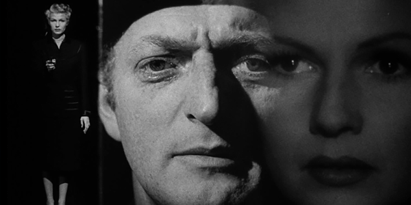
It also goes beyond just being a gratuitous reference to Marion Davies’ pudenda. Famously, the film opens with Kane’s death and it effectively ends when he staggers across the terrace after Susan’s departure. That moment has never really carried its proper weight before, and I suspect that’s because Susan has never been properly presented before. You have to literally see how much Kane is projecting onto her to glimpse the core of the film and to fully understand what drives his character.
Like I said, this transfer is a bit of a mess and its visual inconsistency will likely throw the casual and uninitiated, who might be better off approaching the film through a lower-res presentation, where a lot of the unevenness would be smoothed over. But it’s a tantalizing opportunity for anyone who’s wondered whether Kane deserves its reputation. Yes, you have to work at it, but the dividends are huge.
Because it’s hard to nail down exactly what contributed to which flaws, there’s little point in listing all the various problems with the transfer. But I need to point to two things in particular. Many of the shots seem unnecessarily contrasty and harsh, abuzz with noise that doesn’t seem to be organic grain. And somebody needs to be slapped with a big penalty for consistently pushing the whites to 100 percent. That is not how this film was meant to look. The various white-on-black title cards all stick out jarringly—partly because of that extreme whiteness, partly because they look static, frozen. (Titles were created knowing they would be run through a film gate and reflected off a screen.)
Just as bad are the moments when certain whites are pumped so hard they make some of the scenes look artificially digital. One is the end of the scene in Bernstein’s chairman-of-the-board office where the flames in the fireplace are so distractingly bright they look matted in. Another is Kane’s dress shirt during the legendary low-angle confrontation between him and Leland, which is so white it occasionally seems to float in mid air, independent of Welles’ body.
One last little bit of carping on my way out the door: Why does this release, from the transfer to the extras to even the cover art, feel so half-hearted and perfunctory? It’s like all involved vaguely understood this is an important film but they weren’t really into it. The extras are the same stuff that’s been floating around for decades, presented in a somewhat slapdash way. Kane, of all films, cries out for some context and some new perspectives—there are none here. The cover art looks like it was thrown together in about 20 minutes in Photoshop by some office lackey. What gives?
Does Kane deserve its reputation? Hell, yeah—every square inch of it. And mainly not for the reasons that are usually trotted out. Welles, with this film, beat the studio system at its own game and reinvented filmmaking. The problem is that his innovations were so radical—and I’m talking about things, like thematic material, aesthetics, and the reflexive deployment of movies, that go well beyond technical considerations—that it took more than 50 years before even some of it, half-digested and mostly superficially, began to make its way into mainstream filmmaking. Eighty one years on, we have barely even begun to mine this particularly rich vein, and there are good reasons to think we never will.
Michael Gaughn—The Absolute Sound, The Perfect Vision, Wideband, Stereo Review, Sound & Vision, The Rayva Roundtable, marketing, product design, some theater designs, a couple TV shows, some commercials, and now this.
PICTURE | The transfer’s visual inconsistency will likely throw the casual and uninitiated. But the upping in resolution creates a tantalizing opportunity for anyone who’s wondered whether Kane deserves its reputation.
SOUND | The track exhibits an impressive dynamic range but, for Jiminy’s sake, opt for mono not stereo because that’s how it was meant to be heard
Reference Images
52:26 | medium closeup of Emily Kane
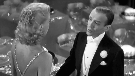
Chapter 15 | the closeups of Susan during her first meeting with Kane
1:01:33 | Emily Kane and her son at the political rally
1:30:54 & 1:30:59 | the alternating closeups of Kane and Susan during her opera performance
© 2025 Cineluxe LLC