Review: Nashville
review | Nashville

Robert Altman’s American microcosm still rings true as an unflinching look at the time—and at the time to come
by Michael Gaughn
May 8, 2021
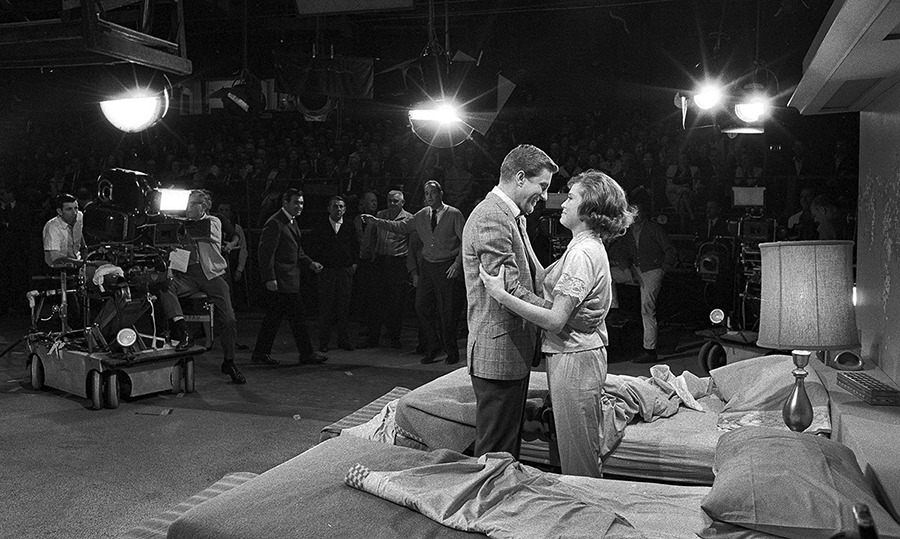
Shot in a city meant to be a not-too-flattering microcosm of the whole of American society on the cusp of the country’s Bicentennial and released during what should have been a celebratory but turned out to be a very flat and bitter, still hung over from the ‘60s, year, everything about Robert Altman’s Nashville screams that this is supposed to be an important film—which is deeply ironic since Altman was rightly known as an iconoclast who openly mocked the idea of important films. And yet he succeeded mightily in creating a movie that was, and remains, important without succumbing to any of the lazy pretentious of Oscar fodder.
Given all that, Nashville needs to be approached on its own terms; and within the context of the country at the time; and, maybe more importantly, from the vantage of the state of the country today. And that all needs to be done without turning this review into a scholarly essay.
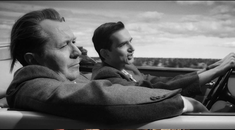
The widescreen (2.35:1) aspect ratio says this is supposed to be an epic, but any action that approaches the epic is treated ironically, and the framing is mainly deployed—similarly to The Long Goodbye but on a much more ambitious level—to capture intimacy; the chaotic intimacy of people alone in groups, but also of people just alone.
Altman saw the country rapidly devolving into individuals encouraged to fetishize their own importance, leading to what the French philosopher Paul Virilio called, awkwardly, totalitarian individualism—an overinflated, ultimately fascist, sense of self that at the end of the day only reinforces how unimportant each individual is. This is probably the strongest through-line in Adam Curtis’s documentaries, that Americans keep confusing narcissistic indulgence with freedom—something corporations are happy to exploit because vanity makes people easy to sell to, and that political groups ride just as hard because it creates the illusion of free expression while stifling meaningful dissent in resentment and rage.
All of this was just beginning to coalesce at the time Altman made Nashville, with corporations groping toward figuring out how to channel the earnest childishness of the ’60s, guiding it through things like EST, Scientology, Ayn Rand, and Tony Robbins so that when people looked around, all they saw were themselves. Altman got a lot of this right but missed one crucial thing—like a lot of people, he assumed that the Carterian malaise would lead to the emergence of a viable third party. What it got us instead was Reagan.
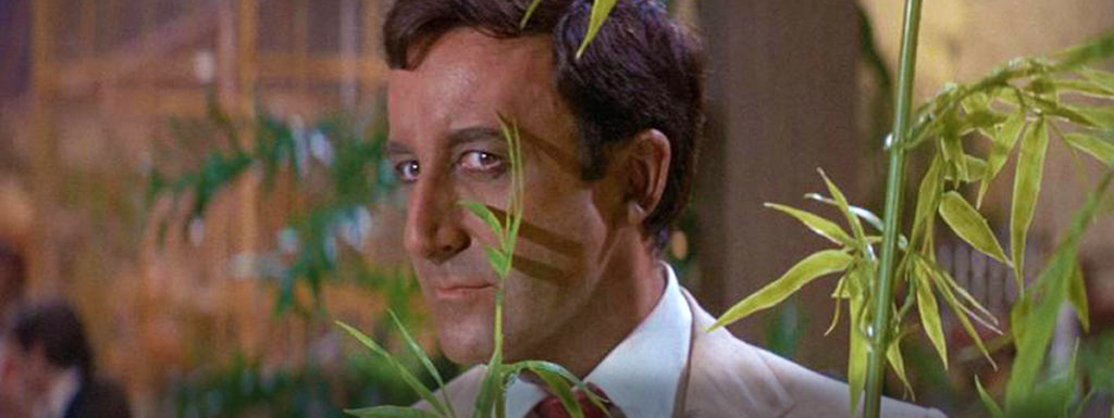
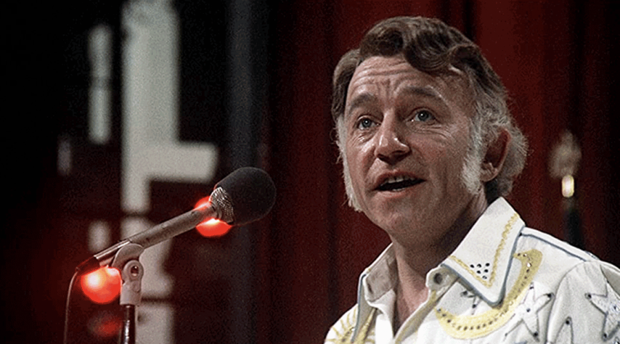
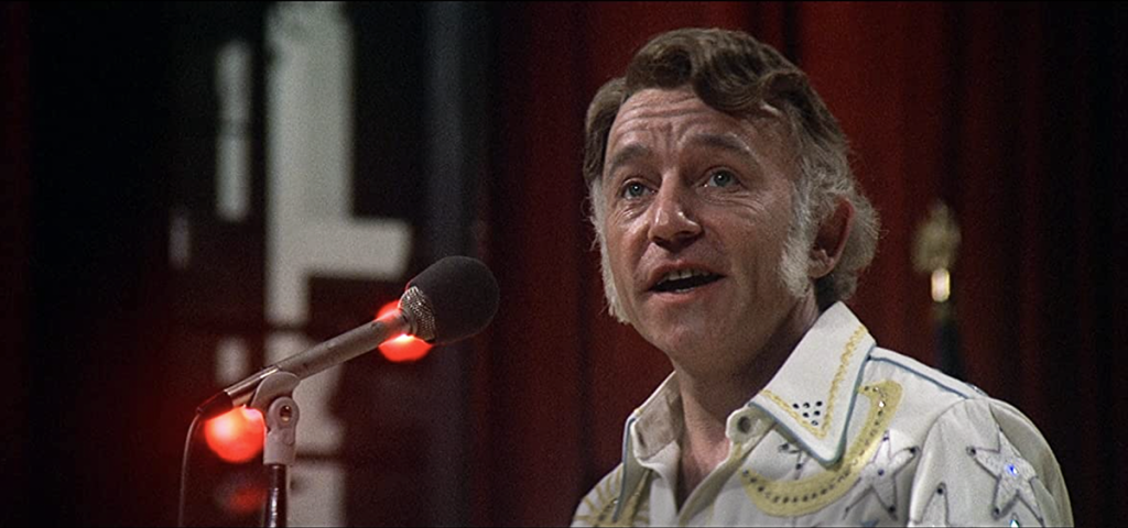
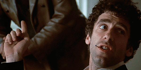
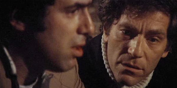
Every character in the film reinforces this theme of crippling isolation—and it’s a massive cast—but there’s no redundancy. Instead, each portrait contributes to a mosaic that, when you step back and consider it as a whole, is devastating. On an emotional level—in a film about the death of emotion—the two key characters are Gwen Welles’ endlessly pathetic Sueleen Gaye and Keith Carradine’s promiscuous troubadour, Tom. Sueleen, hopelessly naive—and dumb—is imperviously optimistic, while the sociopathic Tom exploits the Romantic notion of the wandering minstrel to bed down every woman he encounters. They represented the two poles of American existence at the time, positions that have only become more entrenched and grotesque, and infinitely more dangerous, since.
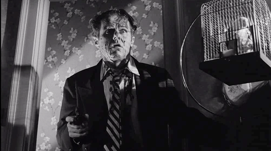
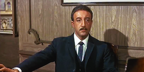
Stepping to one side of all the sociopolitical stuff for a second, you have to marvel at the consistency of the performances Altman was able to draw from such a sprawling group of players. It’s almost impossible to single anybody out because everyone gets their standout moments, but it’s worth focusing in particular on Ronee Blakely, Keenan Wynn, and the always underrated but strangely compelling Henry Gibson. The weakest link is David Hayward—and it’s not really his fault because he did the best he could with what he had to work with, but Altman’s conception of the lone gunmen was stuck in ‘50s psycho-dramas so he failed to grasp how non-human these emptied-out souls tend to be—ironic since he accurately sensed the same thing in Carradine’s Tom.
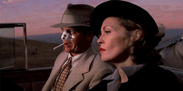
Nothing in this film is supposed to be beautiful—not in the gauzy Geoffrey Unsworth style admired at the time or the kind of relentlessly smart-ass and ultimately vacant compositions we’ve come to idolize since. Like in The Long Goodbye, Altman is going for a deceptive flatness, a grittiness, relying on telephoto lenses so he’s more spying on the characters, having them reveal themselves, than framing them. The “pretty” shots are deliberately vicious, and always tied to Geraldine Chaplin’s clueless documentary for the BBC—the masses of parked school buses turned into a kind of refugee camp and the truly gorgeous in its grunge shot of the crushed and mangled junked cars.
That last shot is a good way of judging the quality of the 4K HDR transfer, which for the most part seems sincerely committed to Altman’s visual plan but occasionally wanders off the reservation—especially early in the film, where some of the shots look a little oversaturated, so traditionally pretty that they border on cartoonish. Not that Altman ever made this easy for anybody, constantly looking for ways to approach the idea of Hollywood movies from the obliquest possible angles, so anyone not completely on his wavelength is inevitably going to make mistakes transferring his work. But the material is compelling enough that you don’t notice the visual stumbles unless you seek them out.
Altman was notorious for his overlapping dialogue, which could occasionally lapse into mannerism but works for the most part here. That approach has been so widely adopted since that it really shouldn’t throw anybody coming to the film at this late date. But the 5.1 mix here didn’t seem to do much to improve the separation between the voices. The music is well, but not spectacularly, presented—but that was part of Altman’s point, that feeble, desperate tunes like these are just crap meant to be borne off by the wind.
I’m probably making Nashville sound preachy and heavy. It’s not. But it’s not exactly light and fluffy either. Altman does a great job of keeping things moving and of creating a pleasant enough surface for people who want their movies to be nothing but bright and shiny distractions. But everything just beneath that surface is troubling, and earned, and disturbingly prescient. This isn’t the whiny kiddie darkness of contemporary film. Altman saw how truly dark things were about to become and recorded it all as faithfully as he could. Nashville is a document of a past lost and a future more than earned.
I can’t let Nashville lie without talking about the ending—not that anything I, or anyone, could say could do it justice. All I can do is point toward it and say that no one has ever done something this coolly unsparing before or since. Altman managed to perfectly sum up the entire film there—not really narratively, but aesthetically, emotionally. It’s all very wry and detached, but it had to be because, without that distance, it would be impossible to watch.
Michael Gaughn—The Absolute Sound, The Perfect Vision, Wideband, Stereo Review, Sound & Vision, The Rayva Roundtable, marketing, product design, some theater designs, a couple TV shows, some commercials, and now this.
PICTURE | The 4K HDR transfer seems sincerely committed to Altman’s visual plan but occasionally wanders off the reservation, especially with some slightly oversaturated shots that border on cartoonish
SOUND | The 5.1 mix doesn’t do much to improve the separation between the voices in Altman’s infamous overlapping dialogue. Meanwhile, the deliberately crappy music is well, but not spectacularly, presented.
© 2025 Cineluxe LLC