• Type:
  • Genre:
  • Duration:
  • Average Rating:

Michael Gaughn

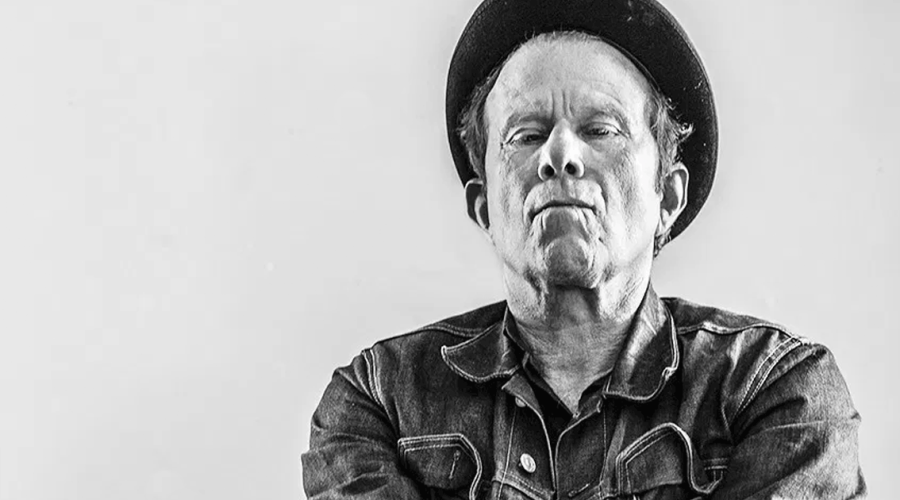
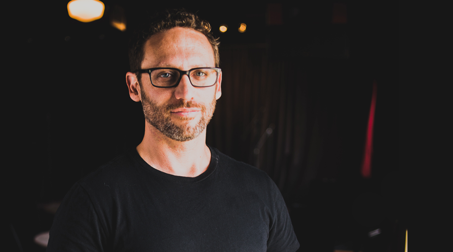
Noah Kaplan–Bringing Entertainment & Design Together Again, Pt. 4

Noah Kaplan Pt. 4

Noah Kaplan—Bringing
Entertainment & Design
Together Again, Pt. 4

by Michael Gaughn

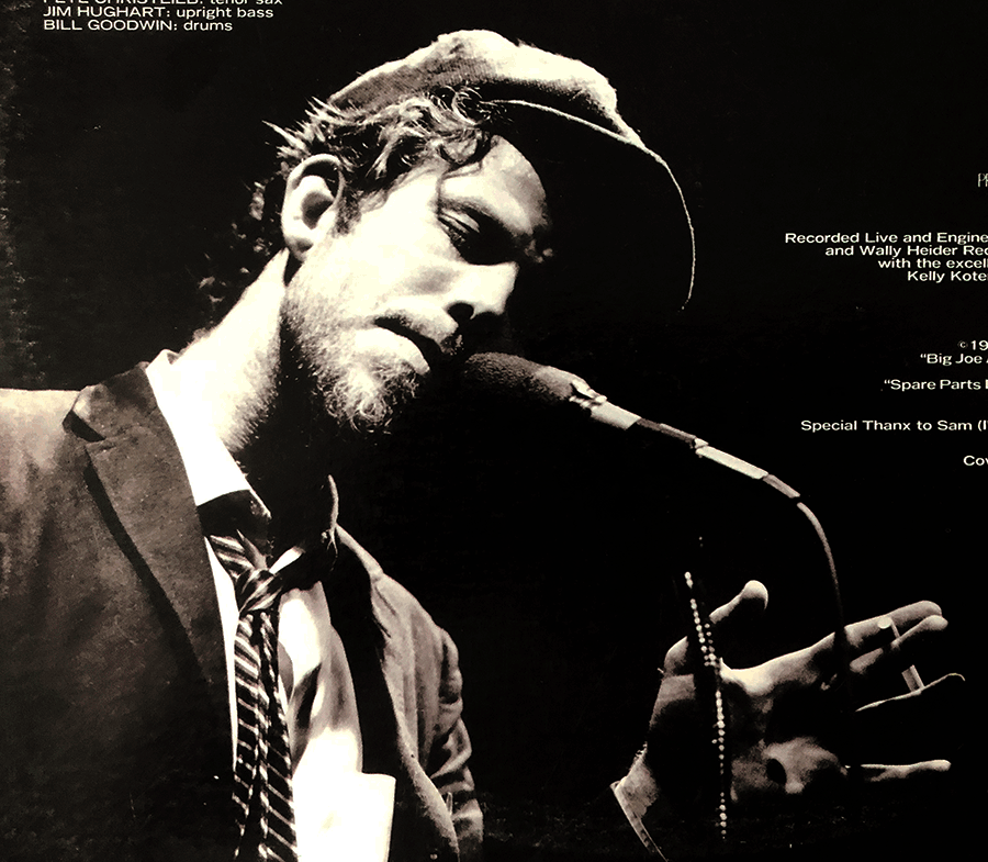
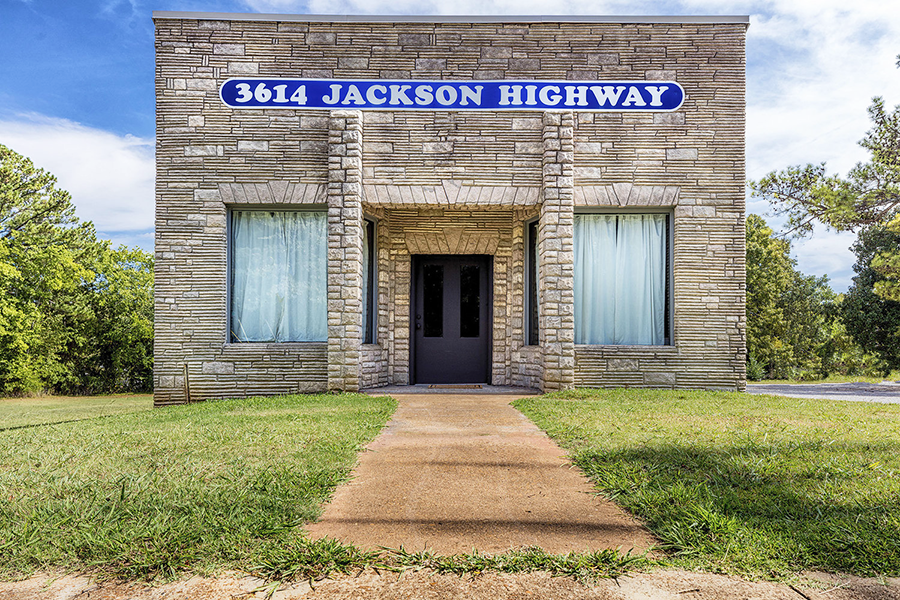
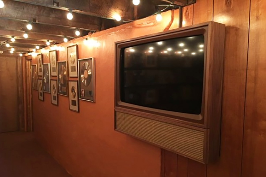
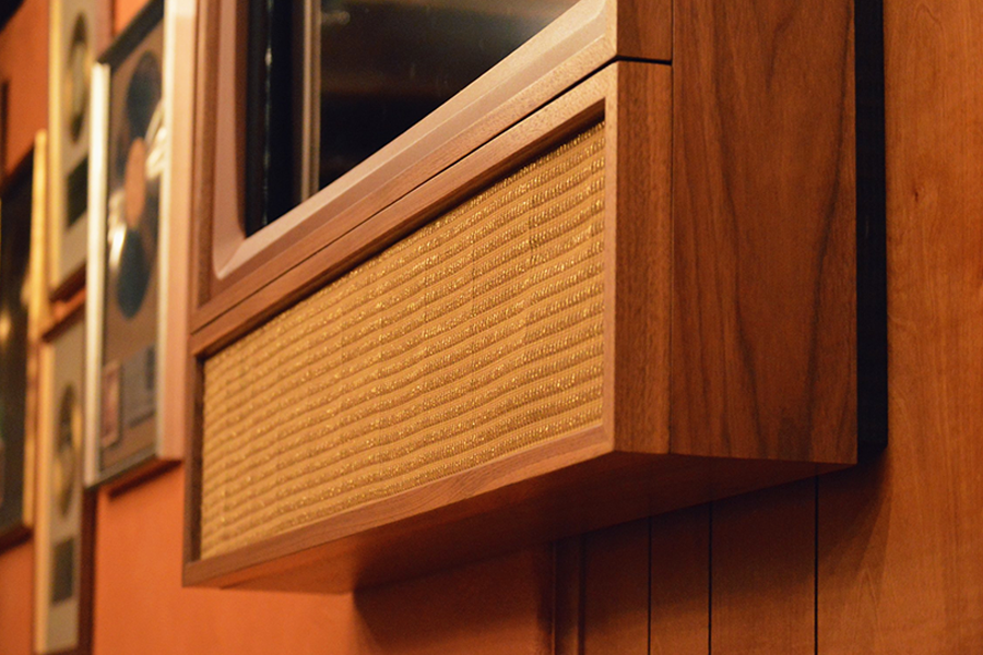
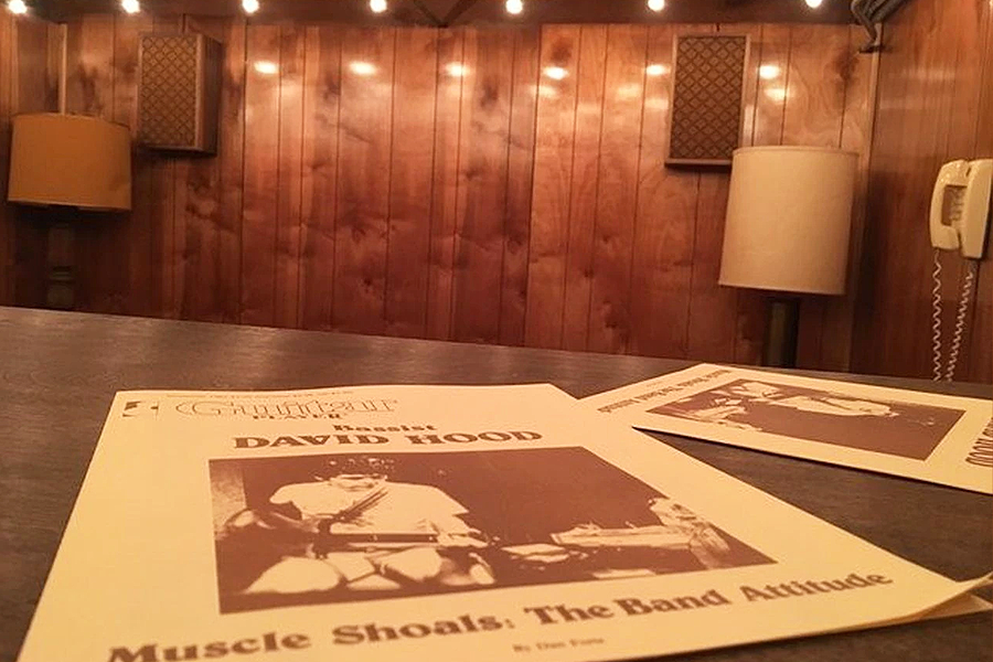
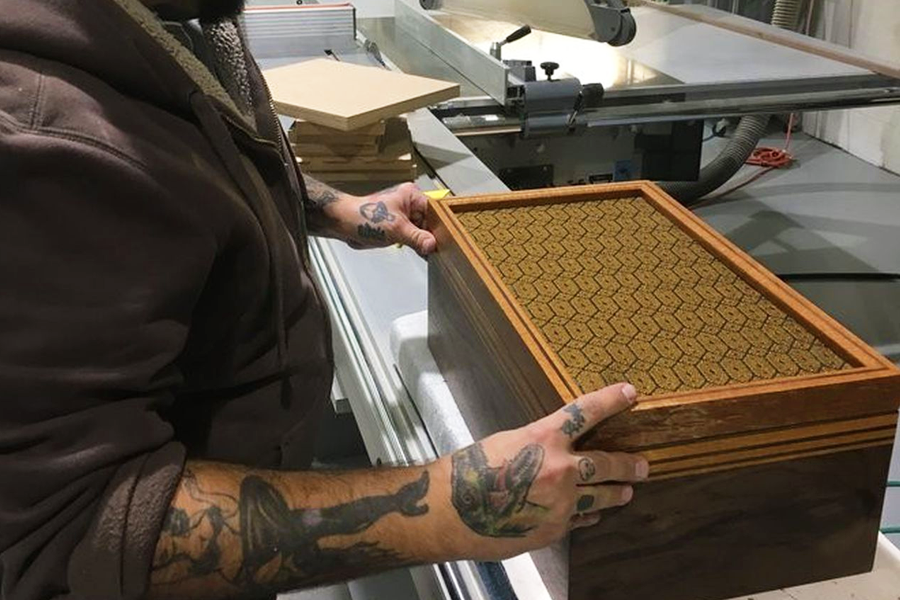
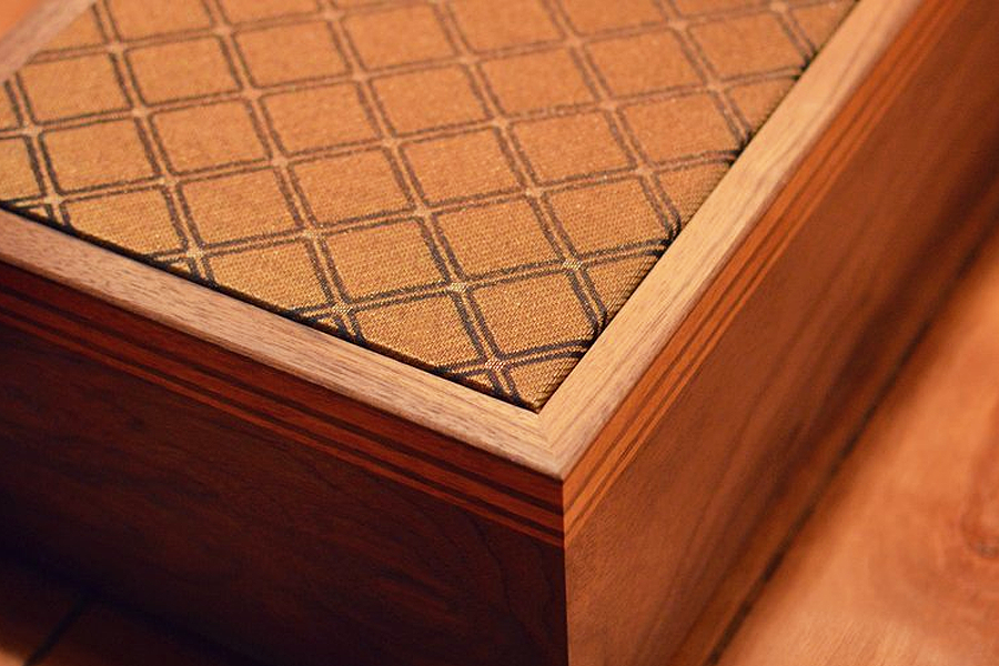
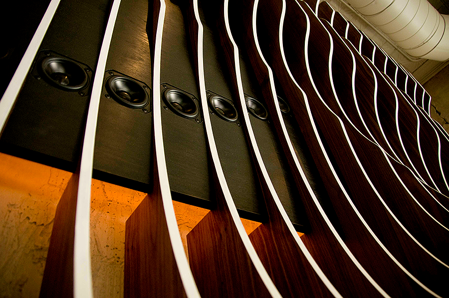
capturing the spirit of the ’70s, without the kitsch, at Muscle Shoals Sound Studio

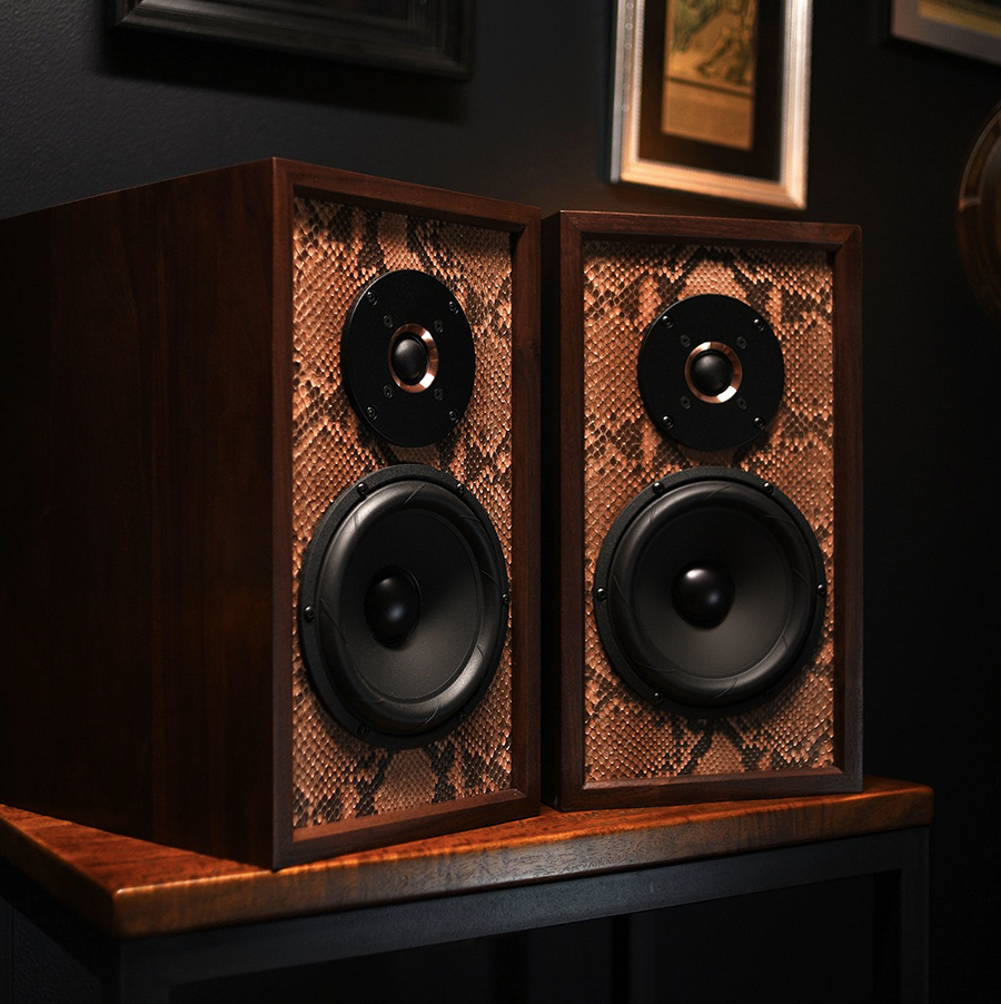
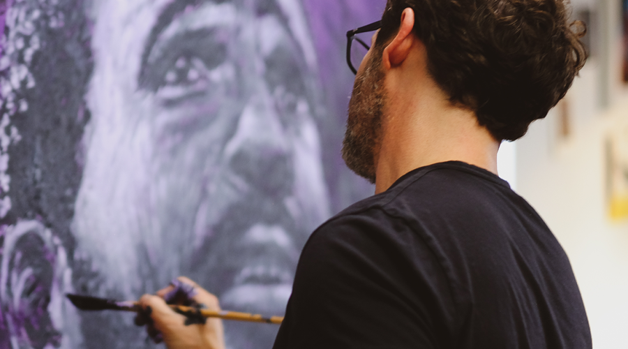
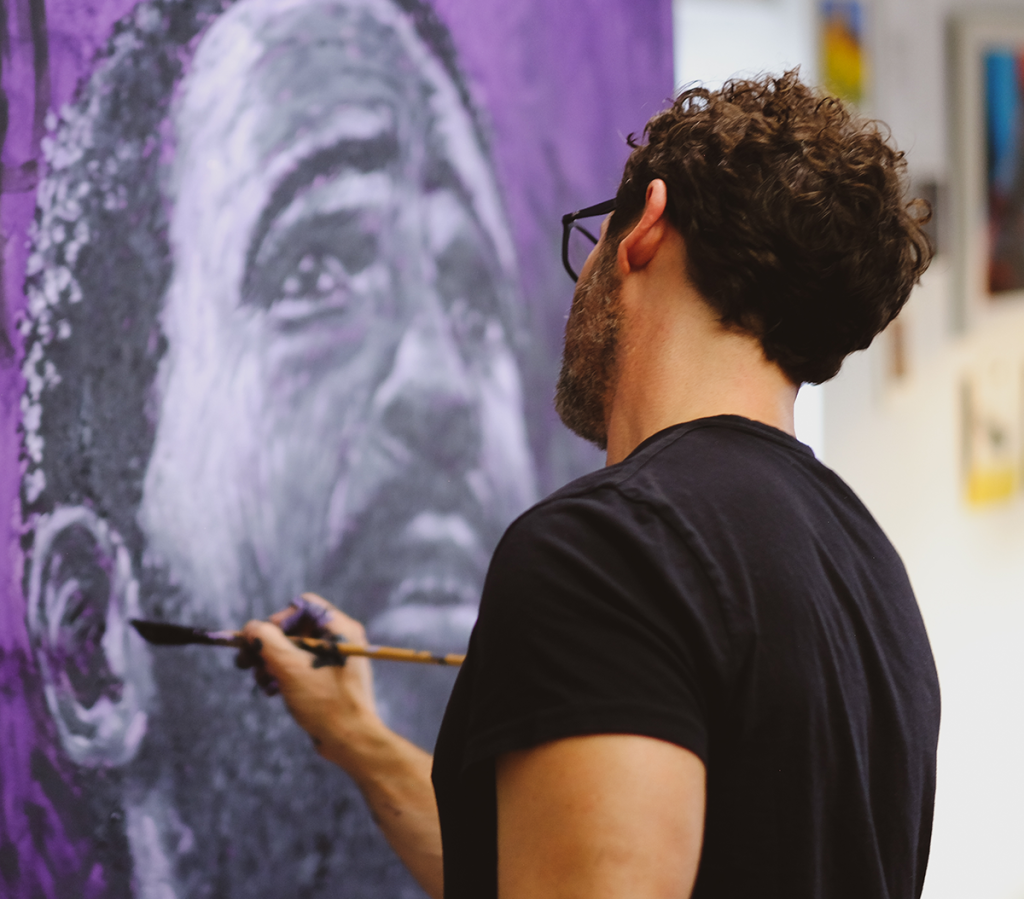
a custom python-skin design for Wu-Tang Clan’s Raekwon “The Chef”

“We’ve got to show that technology companies today are as interested in how things look, how they’re sourced, how they make you feel,
and how they’re end-of-lifed”

The interview concludes with a glimpse of a time to come when entertainment tech will once again fully embrace innovative design

April 21, 2022

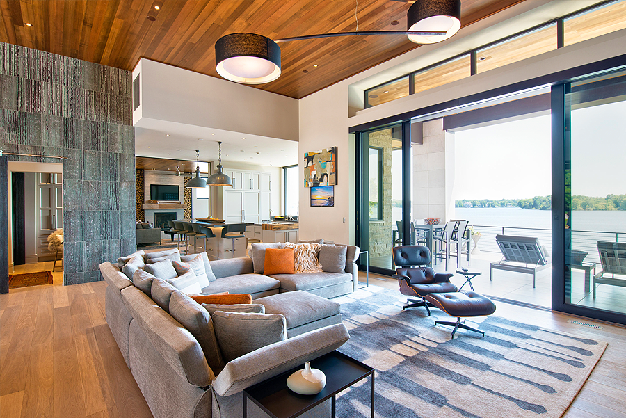
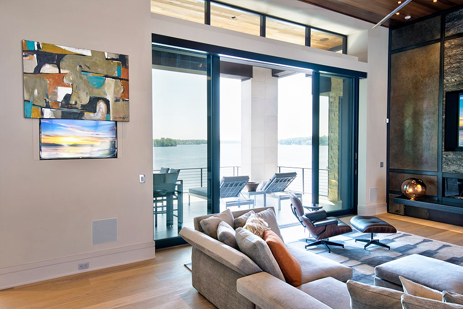
As we wrap things up, Leon Speakers‘ Noah Kaplan neatly brings things full circle, weaving together all the threads he laid out in the previous three installments. The focus here is primarily on the future—not just of Leon but of home entertainment in general as it continues to spread out, in increasingly sophisticated forms, throughout the home, and thanks to more nuanced and responsive technology and design, evolves from an often awkward add-on to an integral and stylish part of the domestic environment. 

—M.G.

You mentioned that the mandate with Muscle Shoals was do to a ‘70s-based design. That era’s kind of dangerous because no matter how you approach it, it can quickly descend into kitsch. How do you avoid that when you’re approaching a style like that or something similar?

That’s where subtlety plays in. We always call it a drip. We don’t ever want to go into full IV mode. I’m super conscious of that when we’re designing. Our designers are working on stuff usually five to ten years, so we’re always designing for ten years on. We have some super crazy concepts, but we’re making sure it’s a very slow progression. So first let’s add new materials, then a color choice or a fabric choice. And then let’s add design options, like trim options. But in most cases still, especially in American design, we’re working with very subtle and simple styles. 

Now, we do make sound sculptures that are full-scale expressions of ourselves. And the customer who wants a sound sculpture is somebody who loves art, so they want that piece to pop. Another customer might want a product that makes them feel something at the same time that it fits the right aesthetic of their home design, but they also don’t want it to yell at them. So it’s a tightrope still, giving people what they want while also pushing the boundaries just a little. Because you always know who the customers are who want you to totally trash boundaries and just create. But that’s three or four times a year compared to the ten thousand times a year when we create for the people who need stuff everyday. 

Theo Kalomirakis always reminds me that during the pinnacle of his career, in the ‘90s, he had client after client who just wanted to play. And if he could sympathetically get them on the same wavelength with him, that they were going to be creative and were going to play, that’s when he did his best work. By the 2000s, those people started to go away. Most of his clients just wanted glorified screening rooms and it wasn’t creative anymore.

I like those words “sympathetic” and “play”—two of the things we try to find all the time now. If I get to get on the phone with a customer, which is rare, look out. We’re goin’ there. Like when we just did that thing for Raekwon, who wanted that python skin and so I’m finding that python skin. That’s what we want. That’s a desire. I had a conversation with a customer this week who’s moving to an amazing place in LA but has no idea what to put in there. She showed me with her phone, and she had not one piece of art. And so I’m, like, you wanna play?

So, like Theo, I’m always looking for that one person who wants to go and dig deep. Because I think intrinsically all people do. We’re ready to reconnect with a little bit more of our soul; we want to find something that makes us feel good. And what I really love about what Theo does—he’s creating an escape room, a playhouse. Sometimes we get too serious about stuff. It’s not that serious, and you should be allowed to make mistakes. You should be allowed to build something and then not even like it. We’ve built whole apartments with customers and, not because of us, they didn’t like it when it was done. And, you know what? No worries. Let’s find what you do like.

I feel like we have such a creative industry. All the people we work with are super creatives, and willing and able to start the conversation of, “Hey, I know that’s what you think you might want, but did you know?” Because a lot of people don’t have awareness. And here’s the scary thing: If I asked a hundred people to name five artists, I don’t think they could. Some people might say Van Gogh, but how about one that’s alive? If I asked them to name one architect, I’m not sure they would know. I don’t judge people for that. I just know there’s so much more depth out there than that. So like Theo, I’m always want to play with those thoughts as a way to find someone’s soul. And that’s a really deep, interesting way to design and build stuff for people. That’s what’s cool about architecture and art and design to me.

Let’s talk about the next 3 to 5 years. How do see things playing out, and how would you like to see things play out? What do you think are the trends?

I think the trend actually is going to be in learning—learning like how different trades interact with each other, because as technology infiltrates everything, we’re actually shifting really deeply into IT. And you hear a lot about wellness—about Kelvin lighting and how it affects your health and your mood. That’s a great trend. I want to work in an industry that makes you feel better, not worse. And so I love these multidisciplinary things happening.

I was on a call the other day with an integrator who was saying the usual thing of, “We’re always called in last, so we’ve got to train designers and architects to bring us in early.” And I said, “What have we got to train you on?” We have to start learning more about the terminology of architecture and design, the history of design. Through that, we’ll get to this next zone where design and technology are finally remarried. We’ve got to show that technology companies today are as interested in how things look, how they’re sourced, how they make you feel, and how they’re end-of-lifed. We talk often enough about how this can be a sustainable practice. It doesn’t have to be all about growth and this maniacal big, bigger, bigger.

The future will be more about the wellness of an overall space, which is super interesting to me. So I’m working closely with an architect out of Paris, Daniel Pouzet, who’s one of my favorite designers—a very naturalistic designer. And he’s really thinking about what is going to make the client’s life better through design. So I became obsessed with the idea of, if you see an object that makes sense to 

Kaplan introduces a Leon Ente SoundTile speaker system created in collaboration with artist Mike Han

Part 1

Part 2

Part 3

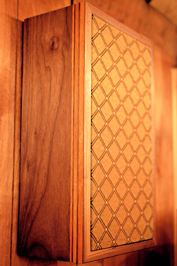
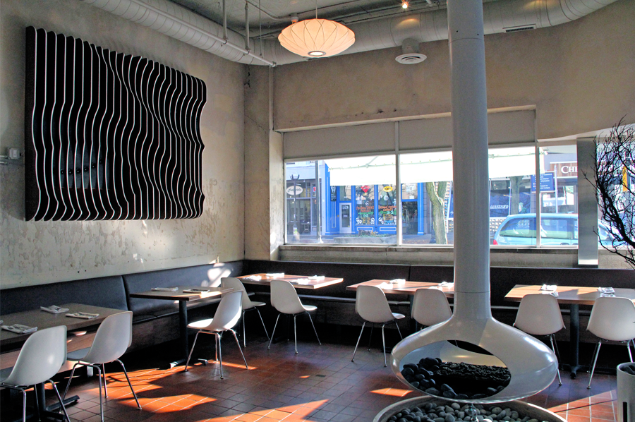
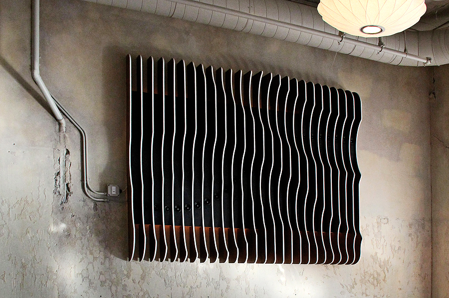
this sound sculpture, custom designed for an Ann Arbor, Michigan cafe, won a BORN award for its combination of functionality and aesthetics

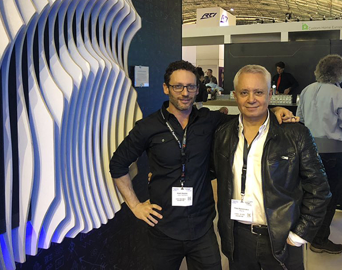
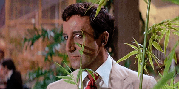
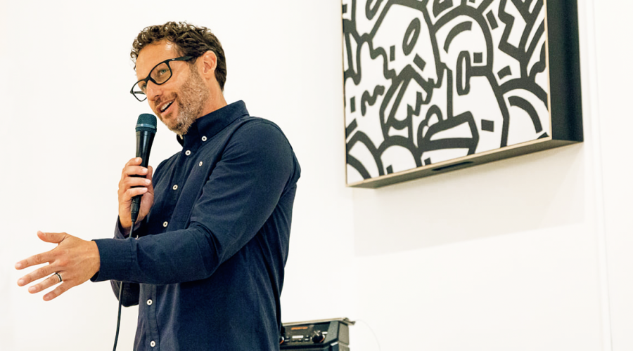
Kaplan with Theo Kalomirakis

related article

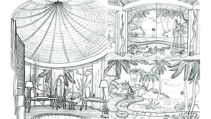
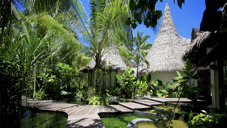
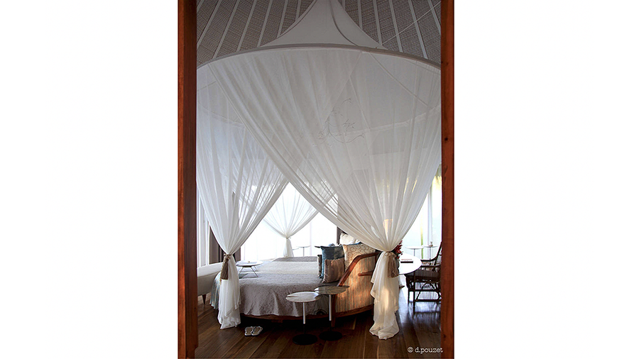
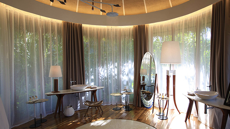
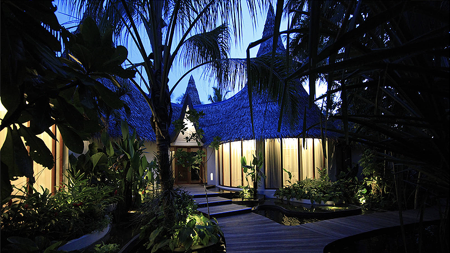
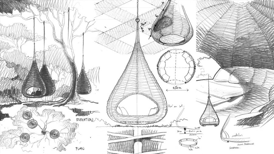
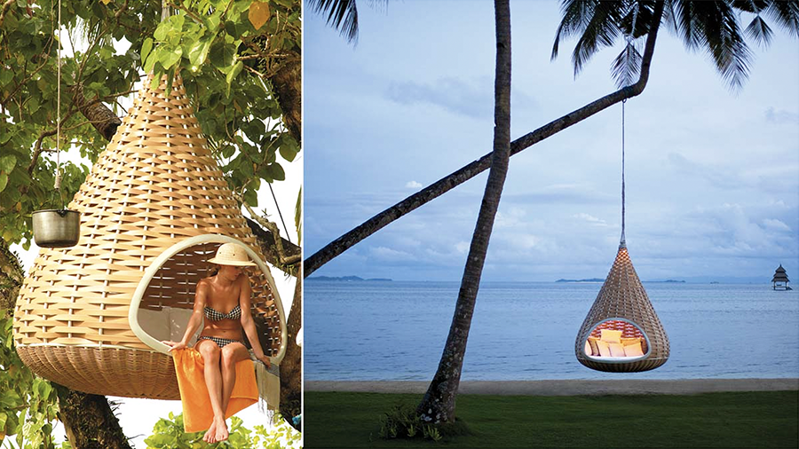
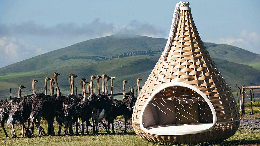
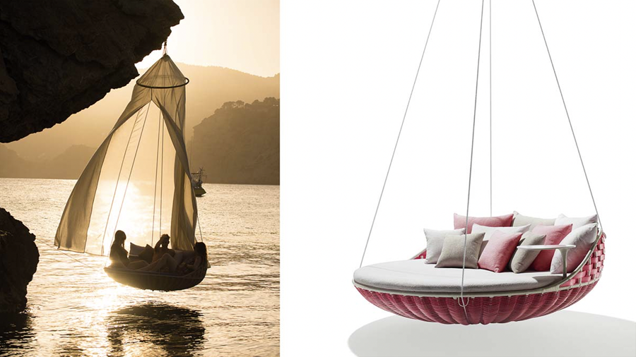
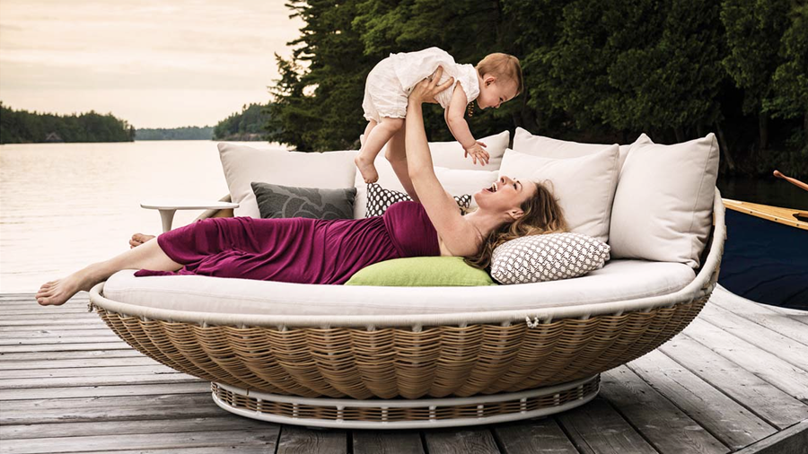
a sampling of Daniel Pouzet  left | the Villas at the Nay Palad Hideaway in the Philippines   right | the Nest Rest and the Swing Rest

Sign up for our monthly newsletter
to stay up to date on Cineluxe

you and resonates with you and makes you feel better, it’s going to add to your overall wellness, it’s going to relieve your stress. We can’t overlook how much stress we’ve all been under. And everyone’s spending so much time at home. That trend’s going to continue.

So what are we going to put our energy into? Are we just going to keep buying commodity things off Amazon? Probably for a few more years, but eventually we’re going to let all that stuff go and think about those few things we actually need or desire. So I’m thinking about everything from how the digital landscape is changing, about how we’re going to present NFTs and new art forms all the way to simple things like what materials can we build with that can be additively manufactured—printed on demand. We’re meeting with a company in Ireland to help us with additive manufacturing because I want to create a sustainable business that doesn’t have a giant environmental footprint.

The trend that makes me nervous is when I see conglomeration, which can hurt the spirit of design, because something that was super important to a founder can become unimportant to another group of people. So I hope there’s a move to independent businesses, creative companies flourishing, small, new entrepreneurs coming up—the next person who can inspire us to repropagate ourselves. But in terms of any trend toward one thing, we all know that the trend is moving in the direction of design.

Michael Gaughn—The Absolute Sound, The Perfect Vision, Wideband, Stereo Review, Sound & Vision, The Rayva Roundtablemarketing, product design, some theater designs, a couple TV shows, some commercials, and now this.

Generic selectors
Exact matches only
Search in title
Search in content
Post Type Selectors

© 2023 Cineluxe LLC

The Strange Journey of Tom Waits

The Strange Journey of Tom Waits

The Strange Journey of Tom Waits

A casual encounter with an early Waits album leads to a radical reevaluation of the arc of his career

by Michael Gaughn
August 29, 2020

Last Sunday evening, I had a chance to do something I hardly ever get to do—devote all my attention to listening to some music. After uncorking a Portuguese red I’d never tried before and flicking on a single, small incandescent lamp, I unsheathed and cued up Side One of Tom Waits’ Nighthawks at the Diner. 

The whole exercise felt a bit like a ritual, and I guess you could consider it the musical equivalent of comfort viewing—going to one of the very few things that has always made me feel grounded to reaffirm its ability to ring true no matter how much the world has changed around it. 

A 1975 Bones Howe-produced two-LP set recorded in front of a live audience at LA’s Record Plant, Nighthawks is Waits in full hipster mode, from the period when he was using his faux Kerouac routine to disarm audiences while going up hard against the pop-music mainstream. You were far more likely to know him at the time for Rusty Warren-type retreads like “The Piano Has Been Drinking” and “Pasties and a G String” as the epic “Tom Traubert’s Blues.”

The first cut, “Emotional Weather Report,” is an extended monologue-quasi-song with Waits resorting to every corny Vegas-comic gag to ingratiate himself, winking so hard the whole time that you can’t help but grin. “I’ve been playing nightclubs and staying out all night long, coming home late—gone for three months, come back and everything in the refrigerator turns into a science project.” “I’m so goddamned horny the crack of dawn better be careful around me.”

But parts of the song that had just struck me as laugh lines before—“with tornado watches issued Sunday for the areas including the western region of my mental health, and the northern portion of my ability to deal rationally with my disconcerted emotional situation—it’s cold out there”—felt strangely bittersweet, veering toward wrenching, this time around. 

Then, as Nighthawks slipped into “On a Foggy Night,” I had a kind of epiphany. It’s common knowledge Waits went through one of the most radical transformations in pop-music history, but it didn’t hit me until then that it was far more a maturation than any kind of rebranding. Once you go beneath the jokey surfaces, there’s actually an amazingly consistent through-line to his work. Songs like Nighthawks’ “Better Off Without a Wife” and 2002’s “All the World is Green” might seem to exist in completely different worlds, but just shift the emphasis a little here and there and the actual distance between them is so slight it’s barely there at all.

A lot of the stuff on Waits’ initial albums might seem gaggy and trite, but view it through the lens of everything he’s done since Swordfishtrombones and you realize how fundamentally poignant those early efforts are. They don’t have the rigor, incisive, often bitter, irony, or unflinching moral probity of his later work, but they aren’t just the throwaway ditties of some one-trick booze-addled clown. 

Then, around the time of “Warm Beer and Cold Women,” I was graced with another seeming insight—that not just his later efforts but the whole of Waits’ work stands at the pinnacle of the American songwriting tradition. Realizing how much Nighthawks honors and feeds from everything that preceded it, in a way then-popular stadium rock never could, made me realize how early on he blew past his contemporaries. 

Most pop performers write songs, but they’re not songwriters. Never having fully immersed themselves in either the history or the craft, instead donning and shedding styles the way they’d try on designer Ts, they not only don’t have a good grasp of the basic mechanics but lack the reverence and awe that would inspire them to match or exceed the best efforts to date. But it’s clear in retrospect that Waits is, and always was, a master, able to pluck the most vital, fertile, and redolent elements out of the musical stream until he was eventually creating songs where every turn of phrase was a perfect evocation of a different aspect of the American tradition, pivoting seamlessly from, say, Hoagy Carmichael to the Delta blues to Kurt Weill to Big Mama Thornton to Stephen Foster to early Satchmo to Tin Pan Alley to a Salvation Army band without ever using any of it as a crutch, and making it all feel whole.

I’m not saying Waits stands alone above his peers and their successors. Randy Newman occupies similar ground. Both used novelty songs early on to win over audiences, lacing them with just enough irony to let the intelligentsia know they were fashionably cynical, but both have gone far deeper than their contemporaries, showing a decidedly unfashionable vulnerability and sentimentality that actually lifts their work to a whole other level.

Newman, of course, is pared down, almost diffident compared to Waits’ flamboyance and radical experimentation. But each is a fully formed songsmith and not the usual mercenary faddist. And, far too honest in their work, neither would stand a chance if they were starting their careers during these far more intolerant and censorious times. 

None of the above is meant to suggest that I drifted from listening to Nighthawks into some kind of brooding meditation. Whatever thoughts I had came unbidden, and flickered just long enough to jot them down here. Maybe they were just a product of my mood or a reaction to listening to early Waits against the backdrop of the strangely trivial and parlous present. Or maybe it was just the wine.

Michael Gaughn—The Absolute Sound, The Perfect Vision, Wideband, Stereo Review, Sound & Vision, The Rayva Roundtablemarketing, product design, some theater designs, a couple TV shows, some commercials, and now this.

© 2025 Cineluxe LLC

Noah Kaplan–Bringing Entertainment & Design Together Again, Pt. 3

Noah Kaplan Pt. 3

Noah Kaplan—Bringing
Entertainment & Design
Together Again, Pt. 3

by Michael Gaughn

“I’m working on product lines right now that will completely change the way we think about screens”

click on the images to enlarge

a sampling of Leon projects shown in a variety of design environments

Sign up for our monthly newsletter
to stay up to date on Cineluxe

On translating the desire to bring design flare back to entertainment tech into real-world product 

April 13, 2022

Having, in Part 1, discussed the movement to free entertainment technology from its anonymity by transforming it into distinctive design statements and, in Part 2, limning some of the companies that are helping propel that effort, Leon’s guiding spirit and tech-design evangelist here talks about his own contributions to the cause, citing examples of how he’s put his theories—and inspiration—into practice.

—M.G.

Until recently, rooms and their functions had been relatively consistent, so interior design could afford to evolve slowly. But digital technology has really flipped that on its head. How do you manage that intersection of traditional design and constantly evolving tech?

The history of design and technology is really short, from about 1850 to 1890—the pre-Edison era to now. So you’re talking about a hundred and fifty years of really intense progress. And incredible technologies keep popping up—I couldn’t have predicted ten years ago that TV screens would be a hundred inches. When I’m talking to a designer, they’ll say, “Hey, the client wants a hundred-inch screen in the living room.” To me, that’s like saying, imagine you wanted a refrigerator in your living room. I’m not going to let you put that in without a cabinetmaker and without trim around it. So we’re trying to create ways where you can have authentic materiality around a product that’s a commodity. A screen is just the content now, whereas a Philco screen from 1950 was a furniture piece. It used to be that both the object and the content were important. The screen has become nothing but a black window, and our job as integrators is to make that thing sing and make it resonate with the space.

This reminds me of conversations I’ve had with Tim Sinnaeve from Barco about how flat panels used to be thought of as something anonymous that just hung on the wall when they’re not on, but how, just given their size, we need to completely rethink what their presence means in a room.

For instance, I design and create NFTs. We’re thinking about, “Where are we going to show them? O, wait, we already have amazing televisions and digital screens all over the house. Perfect. But are they artistic?” More and more, digital is going to become part of the normal vernacular of design, like where a luxury client will have a really broad NFT collection.

I’m working on product lines right now that will completely change the way we think about screens. Screens are a window. They’re an escape, they’re informational, and they have a lot of functionality. But, hell, they need a ton more design. Yves Béhar, who’s one of my favorite designers and creates for Herman Miller and other global brands, designed the Samsung Frame. And his first thing was, “This thing has to look good off.” That’s the job we all have now. And so that’s what’s cool about making parts that are discreet. But I’m imagining like even with an in-wall speaker, what if the fitting looked more beautiful? Or maybe it’s custom painted or made out of woven, braided brass or solid wood—whatever matches the style. I think it will be a slow introduction back to style, but a lot of vendors have to create tools, similar to Lutron, where you can easily show the vast array of styles, to help someone choose.

Is there one product you’ve created that best sums up everything we’ve been talking about?

One of our simplest products we do all this with, which is an everyday one for integrators, is the Edge Media Frame. I always hated hanging TVs on walls. I didn’t like the black screen, I didn’t like seeing down the side, I didn’t like that you could see the differentiation, I didn’t like the materials. Remember when TVs used to be, like, silver? It was painful.

With the Media Frame, we looked back to say, ‘What made a piece like this work with the home in the past?” The Edge is a simple way to frame, stylistically, and say, “Hey, instead of just seeing this black window, let’s put trim around it so you can’t see down the sides. Let’s clean up the edges. Let’s allow the customer to choose custom fabrics.” Instead of just seeing black metal or plastic, all of a sudden you’re seeing an explosion of color. People are using fabric now for the grilles on the soundbars. So they get to choose the fabric and the wood, and then, of course, they get to choose their TV and screen size—and now you can get to choose what’s on the screen. Right now, it’s just the Samsung Frame, but LG and Sony have their versions coming out that will enable the screen to become a player of images or art, of photography or NFTs or whatever you collect. To me that’s beautiful.

So our job as integrators is to paint a picture of a branded product that doesn’t feel store-bought. And now we’re talking about the exact marriage of design and technology, where multiple trades work together to make something seem beautiful and simple, because design, ultimately, is complexity solved. Our job as integrators, with something as complex as a media room, is to make the space feel comfortable and have nothing feel out of place.

Do you tend to design products with a specific style in mind?

Stylistically, I think a lot of people always picture really modern homes, and we’re always shown that most modernist home. But most people are a little more transitional about what they have. And it definitely changes from the Rockies to the coasts. What all our customers have in common is that they know what they love, they know what resonates, so they’re definitely design-conscious. Now, what kind of design? That is not for me to say. We have worked with designs that you would consider farmhouse all the way to super ultra Postmodern. So when I’m thinking about a period or style, what I’m looking at is the soul of the person. Because that’s what interests me about each house. That’s why I love building custom products for individuals, and that’s why we keep adding to these palettes of options. We learn from these people. 

I  was walking a house in Aspen and I was, like, “Whoa! We do not have anything that’s right for this house. We need to rethink everything. Look at how sharp the lines are, look at the contrast.” Right now, contrast is in. You’ll see houses totally clad in black, with warm wood—super-contrasty materials, super-long straight 

Leon’s designs for the legendary Muscle Shoals recording studio in Sheffield, Alabama use authentic designs and materials from the ’70s to evoke the era

lines, gigantic windows—stuff that makes it really difficult for the designers and integrators to work with. So I look at each style and see how do we fit into that, and how do we create products that have flexible parameters to be able to do that?

Like when we had to design for Muscle Shoals, we had to go back to the ‘70s to help them. They just wanted stuff that was period-centric. So we found cloth from the era. We built out of materials from the times. We tried to make the screen look bent and curved. We made the speakers out of multiple tones of brown, something we would never do today. So you’ve got to keep up on your trends. 

Coming Soon: Part 4—Looking into the near and distant future of designing entertainment tech

Michael Gaughn—The Absolute Sound, The Perfect Vision, Wideband, Stereo Review, Sound & Vision, The Rayva Roundtablemarketing, product design, some theater designs, a couple TV shows, some commercials, and now this.

Noah Kaplan painting his portrait of Marvin Gaye entitled “What’s Going On?”

Part 1

Part 1

Part 2

Part 2

Part 4

the Samsung Frame TV wedded with Leon’s FrameBar soundbar

the Edge Media Frame is meant to overcome the bland anonymity of most video-display designs by creating a custom look that complements, rather than fights, a room’s décor

“What all our customers have in common is that they’re definitely design-conscious. Now, what kind of design? That is not for me to say.”

Leon’s designs for the legendary Muscle Shoals recording studio in Sheffield, Alabama use authentic designs and materials from the ’70s to evoke the era

Generic selectors
Exact matches only
Search in title
Search in content
Post Type Selectors

© 2023 Cineluxe LLC

The Godfather: The Greatest, or Just Great?

The Godfather: The Greatest, or Just Great?

The Godfather—The Greatest, or Just Great?

Coppola’s breakout film continues to ascend in the pantheon for reasons that don’t have much to do with the worth of the classic he created

by Michael Gaughn
April 5, 2022

The Godfather keeps creeping up the list of Greatest American Movies, and, with its 50th anniversary upon us, the time seems ripe for a consensus to form to anoint it the best. It’s not. It might not even belong in the Top Ten—unless you subscribe to the movie-by-blender school of filmmaking. It’s an undeniably great effort, but the reasons it still resonates have very little to do with its worth as a film—thus this column.

In the early ‘70s, American society was still numb from the chaos of the ‘60s. Hollywood had tried, and failed, to assimilate the Counterculture, and did an even worse job of repackaging things like Vietnam, civil rights, and the almost complete collapse of governmental authority. (Forget that it didn’t even sense the seismic tech revolution rumbling in its midst.) Beyond lost, the movie industry looked backward, leaping completely over the turmoil—but also considerable ferment—of the previous 15 years.

The Godfather was really the first manifestation of that that really meant anything, the first stab at retro that resonated on the big-box-office scale. The Long Goodbye came the next year, but closed as soon as it opened. Chinatown appeared the year after that and did well with audiences and critics, but Polanski was far more wary of the Romanticism Coppola aggressively embraced.

Every one of those films represented a probe, sent forth to see what spin on the safe and understood (i.e., predigested) past the traumatized public might be willing to fork over big dollars for.

The traditional argument is that The Godfather was somehow transformative because of the brutality of its violence. It wasn’t. It came five years after Bonnie and Clyde, three after The Wild Bunch, and a year after both A Clockwork Orange and Straw Dogs. It had nothing new to teach us there. What was transformative was its wedding of graphic mayhem with the snug glow of the Studio Era. Making violent death not just palatable but heartwarming for the masses is The Godfather’s masterstroke, laying the groundwork for the emergence of late ‘70s blockbuster- and franchise-driven cinema, which continues to plague us today. 

But even that doesn’t explain the film’s continuing appeal. The Godfather represents possibly the greatest pivot in the history of American movies, and continues to rise in esteem year after year, because it is the first blockbuster that was, to its core, cynical. That cynicism became a virus that has infected practically every film made in its wake. No other piece of filmmaking has had a greater influence on changing the tone of the movies, on making dark not just an aesthetic choice but (hopefully not permanently) the coin of the realm.

The Godfather continues to rise in popularity and reputation not based on its merits as a movie but because it embodies the beginnings of, and allows us to reaffirm our faith in, the mass surrender of hope that spawned the Reagan Era and the near-constant churn of too-big-to-fail cinematic exercises in nihilism and oppression we continue to respond to with, “Don’t take it too seriously—it’s just a movie.”

Accepted wisdom sees Coppola and Lucas as developing on parallel paths and then radically diverging. But viewed through the lens offered here, Star Wars becomes not an alternative to Coppola’s work but its natural and inevitable extension. 

Michael Gaughn—The Absolute Sound, The Perfect Vision, Wideband, Stereo Review, Sound & Vision, The Rayva Roundtablemarketing, product design, some theater designs, a couple TV shows, some commercials, and now this.

© 2025 Cineluxe LLC

Review: Annie Hall

Annie Hall (1977)

review | Annie Hall

Woody Allen’s first truly great film is less a romantic comedy than an incisive and beguiling cultural document of New York in the mid ’70s 

by Michael Gaughn
January 5, 2021

It’s impossible to talk about a Woody Allen movie without having to first weigh in on the ongoing efforts to vilify Allen and obliterate all traces of his career. He’s been spattered with so much bile by Hollywood types like Greta Gerwig and Ellen Page who’ve blindly bought into the Me Too herd mentality that there are fewer and fewer people even willing to approach his films let alone consider them objectively. 

I’m hoping to do an appreciation of his career where I can go into all this a little more. What I would ask for the moment is that you try to ignore the grating cacophony of squeaky wheels and appreciate the works of one of the most accomplished filmmakers of the ‘70s and ‘80s for what they are.

Annie Hall is known as a romantic comedy—a perception that had a lot to do with it snagging a Best Picture Oscar. The thing is, it’s not really a romantic comedy—at least not for me. 

That I’ve never found Diane Keaton to be very attractive, or a very good actress, has helped me develop a different—and I think more accurate—take on the film. Annie Hall is actually a very ambitious, incisive, and candid attempt to capture the essence of a particular culture at a particular moment in time via its embodiment in a particular personality—and that personality is not Keaton.

There had to be a reason why Allen suddenly shifted away from all of those gag-driven early movies that served as his film school and allowed him to build the fan base he was able to ride for the next four decades. And there has to be a reason why he suddenly went from being a good-enough comedy director to a fully fledged and inspired filmmaker.

And I think the answer lies in this exchange from the film:

“The failure of the country to get behind New York City is anti-Semitism.”

“But, Max, the city is terribly run.”

“But we’re not discussing politics or economics. This is foreskin. . . . Don’t you see? The rest of the country looks at New York like we’re Left-Wing Communist, Jewish, homosexual pornographers. I think of us that way sometimes, and I live here.”

New York City had pretty much imploded in the wake of the social upheaval of the ‘60s and was in a wretched state by the mid ‘70s. Very much like the way it’s portrayed in Scorsese’s Taxi Driver, it had become a kind of repository for all of the country’s sins. This was probably the city’s darkest period, years before the unfettered avarice of the ‘80s turned Manhattan into a playground for billionaires and Brooklyn into a day-care center for their kids. 

Allen’s identification with the city was so strong that this all had to have sent him reeling. Knowing that it was the prime source of his inspiration—and of his creativity in general—he needed to work out what it meant to be a popular entertainer trying to create within a metropolis that the rest of the country was treating like it had the plague. 

That’s what Annie Hall is really about—Diane Keaton was just his Trojan Horse, a way to open some doors and to make sure the studio got its money back. 

The movie comes very close to being a drama. Just slightly shift the emphasis of almost every one of the scenes and it becomes a sobering look at people desperately trying to define themselves at a time when there were very few reliable guideposts to lean on. Had Allen approached the film that way—although he wasn’t yet that good of a filmmaker—Annie Hall would have been wrenching instead of hilarious.

Consider how Allen treats his own character—which is the same as saying, how he treats himself. This is not a very flattering portrayal—miles away from the narcissism he’s too often accused of. Alvy Singer displays a lot of bluster, and uses his jokes as his armor, but you can tell the guy is hopelessly lost—which Allen expresses through the movie’s loose, improvisational structure, trying on different styles and techniques and attitudes to see what will stick.

But that shouldn’t be mistaken as Allen himself flailing from behind the camera. Just consider the famous scene of him and Keaton on line at The New Yorker, where Allen humiliates the pontificator by dragging a seemingly embalmed Marshall McLuhan into the shot. It’s a nuanced and logistically complex near-3-minute single-take piece of bravura comedy filmmaking that only a self-assured and truly inspired director could have pulled off. And that’s just one example among many.

True, this isn’t the film Allen set out to make, and a lot of Annie Hall did come together in the editing room. But the list of genius directors who’ve confided that the real filmmaking happens in the editing is long. And they’re not wrong. 

Allen started out with a film that was true to his intentions but was all cake and no icing, and he sweetened it just enough to make it palatable for his audience, which was expecting another Sleeper. In the end, he found himself named King of the Romantic Comedy with a couple of Oscars left at his door—an experience he likely wasn’t expecting and that probably scared the bejeezus out of him.

Annie Hall was Allen’s Rhapsody in Blue—a loosely structured, jazz-inflected work that announced that he had ambitions that went beyond being a successful pop performer. And, as with Gershwin, he was never able to do anything quite that fluid and intuitive again, instead trying on different genres defined by others with decidedly mixed results.

But Hall holds up. A surprising number of the jokes and gags still land, his approach to the material and the scenes remains fertile unexplored territory for other filmmakers, and the way he took the careening wreck of New York City and turned it into the most vital and romantic place on Earth is still seductive. The City owes him a statue—but then some group of Yahoos would come along and demand that it be taken down.

Talking about seeing the film in HD is difficult. Gordon Willis’s cinematography is known for being dark and bold, but it’s very subtle, almost documentary-like here. In HD, it feels flatter than it should—not unwatchable, just flat. And then there’s the weird dilemma of having to separate the shots where he deliberately and beautifully exploited grain—like the famous shot of Annie and Alvy standing on a pier at twilight with the East River bridges arrayed behind them—from the ones that are overrun with grain because the elements for the transfer probably weren’t the best.

As for the sound—come on, this is a Woody Allen movie. One of Allen’s greatest strengths as a  filmmaker is the ability to make his material compelling without relying on CGI, flashy editing, explosions, or other gratuitous effects. This is moviemaking stripped down to its essence, and it can be cleansing to luxuriate in a piece of cinema that doesn’t pivot on its ability to mercilessly abuse you.

Forget that this is supposed to be a romantic comedy. Forget about its Oscars. Forget about the well-heeled mob of Hollywood conformists bleating for Allen’s blood. Approach Annie Hall as an adventurous and innovative and unusually honest piece of filmmaking and you’ll get the chance to experience—or re-experience—one of the best American films of the final quarter of the last century, the movie that helped start the wave that brought New York back from the dead, for better or worse.

Michael Gaughn—The Absolute Sound, The Perfect Vision, Wideband, Stereo Review, Sound & Vision, The Rayva Roundtablemarketing, product design, some theater designs, a couple TV shows, some commercials, and now this.

PICTURE | This HD presentation feels flatter than it should—not unwatchable, just flat

SOUND | Come on, this is a Woody Allen movie

© 2025 Cineluxe LLC

Review: The Godfather

The Godfather (1972)

review | The Godfather

The 4K treatment of this cinematic landmark can seem stunning—until you watch the new transfer of Part II

by Michael Gaughn
April 1, 2022

I was all prepared to write a review that boiled down to: Yes, there are problems—maybe a lot of problems—with The Godfather in 4K, but it’s ultimately worth watching because it wipes away the memory of all previous home releases, allowing you to reconnect with the film anew. But then I watched The Godfather Part II in 4K. And I realized I’d been had. I’m a little ashamed to admit that had I not watched the sequel before I wrote this, you would be reading a completely different review—one I would have had to repent for later.*

I’m going to be stepping onto Dennis Burger’s turf a little here, but that’s unavoidable. And, unlike with most any other two movies out there, I don’t think it’s unfair to review the first Godfather film in the context of Part II because it’s extremely likely vast numbers of people will watch both of these films in 4K, possibly back to back, and will end up having an experience somewhat similar to mine, although they might not reach the same conclusions. 

It all comes down to this: The Godfather Part II looks like the film Gordon Willis shot and that Paramount presented in 1974. The transfer is visually consistent throughout, whatever tweaks were made to the images are judiciously subtle, and there’s a constant flow of organic grain that gives it an appropriate analog energy and warmth. The first Godfather, though, is all over the map visually, with HDR accentuating the flaws of the not infrequent patches of compromised footage and with a lot of heavy-handed digital manipulation scrubbing away far too much of that gorgeous, essential grain. Yes, it does sometimes feel like you can reach into the frame, but that’s not the movie Willis lensed. The 4K transfer can be dazzling when you first experience it—I readily admit I fell for it like a brick—but it’s ultimately just a kind of gimmick that couldn’t run more counter to the gritty elegance that helped define the original film. 

Reviewers rarely find themselves in this position—a double-edged one that puts their necks way out there because it allows them to be held so easily accountable—but feel free to take any of the examples below from the first film and compare them to how similar material was handled in the transfer of the second. I just don’t see how anyone could argue that The Godfather transfer is the more faithful presentation of the two. And, beyond that, I don’t see how anyone could find the overall experience of The Godfather in 4K superior to the experience of Part II in the same format—unless, of course, you just never much liked Part II.

Let me cite a few things, then try to pull the threads together.

The first moment that got my attention and that, in retrospect, felt off, was early in the opening scene when it cuts to a medium shot of The Godfather sitting behind his desk. Everything until then had looked OK, but that shot had the video-like sheen that always sends my antennae shooting out a mile whenever I’m watching something in HDR. Fortunately, there are few instances that egregious in the rest of the transfer, but it was the first strong signal that this presentation might not adhere closely to either the letter or the spirit of the movie. 

A more frequent problem was that, once you decide to start cleaning and enhancing shots, you inevitably expose and accentuate the flaws in the most compromised footage, which can seriously disrupt the experience of watching the film. It’s not news that many of the outdoor shots during the wedding sequence have never synced up well visually. All of that is only hammered home here. Similarly, the reliance on stock footage was beginning to die off at the time The Godfather was released, but audiences were still willing to buy into the illusion. But all of the too crisp, too vivid original footage to either side of the stock stuff here makes the use of the latter seem inept. The shot under the el, which has always been borderline, goes full-bore late-period Monet in this transfer, in a way that would make an uninitiated viewer question the filmmakers’ competence.

Then there are the seriously crushed blacks—not consistently but often enough to stick out sorely. All of which is ironic for a film that’s legendary for its chiaroscuro style. Two easy-to-spot examples: When the Don is getting ready to leave the Genco offices with Fredo, right before he’s gunned down in the street, and the tighter shot on the black car that stops in front of the hospital while Michael and Enzo stand at the foot of the stairs. Instead of having the sense of someone lurking in the back seat, you get a glimpse into an impenetrable void.

My biggest slice of beef, though, is reserved exactly for the shots that look most stunning. With almost all trace of the grain banished, they’re pristine, vivid, and yes, like you can reach into them—but that’s not the movie that captured the public imagination back in 1972 and influenced practically every film made since. You won’t find anything like that in Part II—not because some of the footage couldn’t have been distorted that way but because whoever handled that transfer decided not to go there. The scene in the first film where Michael finds out his father has been left unprotected at the hospital loses much of its tension because, without the constant low simmer grain provides, the shots of the empty corridors just look impressive, not menacing.

I doubt any of my arguments will sway anyone in the “Look—pretty!” crowd that sees anything that’s been given an HDR buff and shine as an improvement, but chances are they’re just watching Godfather the conformist shibboleth—the something-to-have-on-in-the-background that cable’s AMC has managed to marathon into the ground—rather than the movie itself. All I can say is that they don’t know what they’re seeing, therefore, they can’t know what they’re missing.

Look: 4K will always be a very mixed blessing. When done right, it can result in transfers like The Shining, A Clockwork Orange, and The Godfather Part II that honor the films they’re meant to serve. But then there are Jabberwocks like Citizen Kane and The Godfather, disjointed experiences that take you someplace other than where the filmmakers wanted you to go. Watching The Godfather in 4K HDR can be an enjoyable, even edifying, experience, but you have to understand and make allowances for what’s feeding what you’re seeing. The Godfather Part II, though, is pure viewing pleasure, something you can surrender to utterly without ever once having your critical brain get in the way.

*This is, for me, a very unorthodox review because it focuses, from start to finish, on the transfer of the film. Traditionally there would also be some commentary on the film itself, its cultural or historical context, etc.—which, in most reviews, adds up to little more than obligatory throat-clearing. Here, it’s actually important—but not as important as telling the tale of two transfers. Which is why I’ve shuttled my comments on the movie itself to a separate column.

Michael Gaughn—The Absolute Sound, The Perfect Vision, Wideband, Stereo Review, Sound & Vision, The Rayva Roundtablemarketing, product design, some theater designs, a couple TV shows, some commercials, and now this.

PICTURE | Crisp and bright and visually dazzling, with blacks frequently taken deep into the netherworld—but that’s not the movie that changed filmmaking forever

SOUND | It was originally mixed in mono so it should be listened to in mono. Unfortunately—and inexcusably—that’s not an option here.

© 2025 Cineluxe LLC

Noah Kaplan–Bringing Entertainment & Design Together Again, Pt. 2

Noah Kaplan Pt. 2

Noah Kaplan—Bringing
Entertainment & Design
Together Again, Pt. 2

by Michael Gaughn

“One of the best companies we work with, Admit One, has engineers now to help customers choose things like their fabric, shades, and light fixtures so the tradespeople can go ahead and figure out how to integrate all that technology.”

click on the images to enlarge

The Josh AI Nano voice-activated system controller
top | placed within custom millwork
bottom | integrated within a Lutron home-automation keypad

Sign up for our monthly newsletter
to stay up to date on Cineluxe

The man behind Leon talks about the other companies helping to drive the movement to make entertainment tech fashionable again

March 30, 2022

In our previous conversation, Leon Speakers’ founder Noah Kaplan described how his efforts are grounded in the work of innovative mid-century industrial designers like Dieter Rams, who found ways to turn pieces of entertainment technology into compelling design statements. Picking up the ball again below, he discusses the contemporary companies that share his don’t-hide-the-gear approach to not just integrating but showcasing technology in the décor of design-conscious homes. 

—M.G.

Since home theaters are the most technologically sophisticated room in many high-end residences, they’ve functioned as a kind of lab to get people used to tech and how to integrate it into the design of the rest of their environment.

I love what you just said because that was the intention of that space. The intentionality of a home theater space is generally managed by a design team. The integrator works in tandem with a home theater designer who handles all of those little details like the chairs, the fabrics, the paneling so the integrator can say, “Where can I put my technology? Cool.” 

We’re starting to see integrators bringing people like designers in-house. One of the best companies we work with, Admit One, has an on-site interior designer, and they have engineers now to help customers choose things like their fabric, shades, and light fixtures so the tradespeople can go ahead and figure out how to integrate all that technology. 

above | For this collaboration with Admit One Home Systems out of Edina, Minnesota, Leon created custom speakers that play off from the lighting in the skylight beams

The best firms know how to work in tandem with the other trades. It’s just a giant responsibility to put on an electrician to say, “I want all the light sockets to look this way, and I want you to choose the Lutron light socket and then choose the style and finish from the thousands of finishes available.” So we’re seeing this new interim position of design being an immense part of the conversation between clients, designers, and integrators.

The integrators of the world need to know the language of the designers and architects. And I think that’s an amazing trend. Like Josh AI just came out with the Nano—a beautiful little fixture that easily fits into spaces so designers can comfortably work with it.

How has the interest in having high-quality entertainment tech in spaces beyond the theater room played out with what you’re doing at Leon?

Home theaters really were a harbinger. So let’s apply that to the living room. At Leon, we call something like that “living space theater,” which is a mix of blended technology and oftentimes complementary design. We rely on interior designers because, by the time we’re involved with the interior, the designer is more involved than the architect, so we know whatever we do has to work with the interior-design intentions. 

It’s really cool to actually see a design get introduced. We consider ourselves as much a design company as a speaker company, and a lot of our calls are about design consultations. So we’ve started bringing in architects and designers to work with us here on staff. So now we have an insider view.

above | This CEDIA Integrated Home of the Year from 2018 features Leon Profile Series side-mount speakers and a Media Décor Eclipse art lift

Do you find there are other companies that are basically on your wavelength that you can collaborate with?

We work with a lot of bespoke manufacturers that get it. Séura is a great example. I work very closely with the people on their team, like Gretchen Gilbertson. She has a very similar design belief to mine about how to bring technology into the house in a way that’s multifunctional. Number one, it has to be built properly so it can meet the technical specifications, but it also has to have the right style and quality to fit in a luxury home. She creates a tremendous palette of products. 

Lutron is an amazing company that does a great job of not only creating perfect integration with things like with its Radio RA and Homeworks control systems but also has an immense portfolio of fixturing. It’s amazing how well they train people. They show integrators how to make the lighting and shades work perfectly but they also train their designers to be able to choose perfectly. So, for us, Lutron is always a design leader. They have an amazing asset catalog, they’re always up to date and modern, and they’re always making changes. You see Savant starting to make moves toward this, more on the lighting side, bringing in other disciplines to try to add shades or add lights. I see a lot of others working on this as well, so I would say it’s a trend for most. 

But the hardest thing for a tech company is letting go. For me, I had to completely let go and say, “I want an actual architect to design the products. I want real interior designers to choose the fabrics.” So I brought them in and said, “What do you need us to do to make this conversation work for you?” They’re definitely not talking about frequency response—that’s my job. It’s like, I’m the plumber. They don’t care about what the cone material is on the woofer, but they absolutely care whether the cabinet is made of sustainably sourced black walnut. 

Coming Soon: Part 3—Noah discusses some Leon projects that highlight where his company is and where it’s going 

Michael Gaughn—The Absolute Sound, The Perfect Vision, Wideband, Stereo Review, Sound & Vision, The Rayva Roundtablemarketing, product design, some theater designs, a couple TV shows, some commercials, and now this.

Part 1

Part 1

Part 3

Part 3

Part 4

For this collaboration with Admit One Home Systems out of Edina, Minnesota, Leon created custom speakers that play off from the lighting in the skylight beams

This CEDIA Integrated Home of the Year from 2018 features Leon Profile Series side-mount speakers and a Media Décor Eclipse art lift

Lutron’s Alisse lighting control, shown here in brushed brass, comes in 11 designer finishes

Generic selectors
Exact matches only
Search in title
Search in content
Post Type Selectors

© 2023 Cineluxe LLC

Review: Citizen Kane

Citizen Kane (1941)

review | Citizen Kane

Perhaps the most innovative and audacious movie ever makes the move to 4K

by Michael Gaughn
March 21, 2022

No matter how you slice it, a 4K HDR release of Citizen Kane is a big deal. Whether or not you agree that it’s the greatest American film, it is undeniably a hugely important one, and its leap to UHD is inevitably to going draw more attention than it would for most other movies.

So let’s get this out of the way: If you come to this expecting an audio/video experience that’s significantly better than has been delivered on the earlier home releases of Kane, you’re going to be disappointed. If you’re approaching Kane for the first time and are expecting the 4K to help sell you on the film, it likely won’t. And if you’re skeptical of Kane and its reputation, this release could very well help shore up your biases.

That’s not to say you shouldn’t check it out—you should; but just don’t expect the picture or sound to be any kind of tremendously revelatory experience. Adjust your expectations accordingly. There are revelations here, but they’re mostly reserved for attentive viewers already familiar with the film who are willing to tolerate some pretty erratic fluctuations in the presentation. For them, it will be the first home release that even hints at what Kane was like when it was released in May 1941.

The good stuff first: There are certain shots—typically medium shots and closeups —that have a subtle gradation and a luminous quality that suggest what Kane looked like when the first prints were struck. Since the original negative is lost, it will never be possible to confirm that conjecture but, if true, it suggests that Orson Welles and cinematographer Greg Toland were going for a much more nuanced look than was usually found in Hollywood films. And, if true, it was likely a (successful) effort to give Kane a quiet emotional resonance, to help temper the often blind and sometimes brutal actions of its lead character.

Taking in those shots, and then imagining that look applied to the whole film, Kane becomes a different experience—one very similar to my recent encounter with the 4K HDR release of A Clockwork Orange, which had never felt right in any of its earlier home releases. Orange is a nasty film, but Kubrick never meant for it to be that relentlessly nasty, and seeing the cinematography finally done right gave it wit and verve, restoring the original aesthetic balance.

Certain shots in Kane have a startling depth and subtlety very much reminiscent of what Alfred Stieglitz was able to achieve with the platinum prints of his photos. (See, for instance, the shots listed in the “Reference Images” sidebar.) Little of the rest of Kane in this 4K release—and none of Kane in the earlier home releases—looks much like this, and it’s hard to know how many of those deviations in the look, sometimes extreme, are attributable to having to make up for the lost negative, for the elaborate compositing and optical printing used in many of the shots, or other factors. 

All of the above might sound like esoterica—it’s not. If Kane was meant to have a look more toward those tighter shots I cited, then we’re talking about a different, and more profound, film. “Rosebud” has frequently been dismissed as just a gimmick, a way to keep the audience hooked during Welles’ elaborate time-jumping, but if the original photographic style was meant to give certain shots and scenes a subtle but sustained emotional subtext, then Rosebud becomes something much more than a sop for the masses.

It also goes beyond just being a gratuitous reference to Marion Davies’ pudenda. Famously, the film opens with Kane’s death and it effectively ends when he staggers across the terrace after Susan’s departure. That moment has never really carried its proper weight before, and I suspect that’s because Susan has never been properly presented before. You have to literally see how much Kane is projecting onto her to glimpse the core of the film and to fully understand what drives his character.

Like I said, this transfer is a bit of a mess and its visual inconsistency will likely throw the casual and uninitiated, who might be better off approaching the film through a lower-res presentation, where a lot of the unevenness would be smoothed over. But it’s a tantalizing opportunity for anyone who’s wondered whether Kane deserves its reputation. Yes, you have to work at it, but the dividends are huge.

Because it’s hard to nail down exactly what contributed to which flaws, there’s little point in listing all the various problems with the transfer. But I need to point to two things in particular. Many of the shots seem unnecessarily contrasty and harsh, abuzz with noise that doesn’t seem to be organic grain. And somebody needs to be slapped with a big penalty for consistently pushing the whites to 100 percent. That is not how this film was meant to look. The various white-on-black title cards all stick out jarringly—partly because of that extreme whiteness, partly because they look static, frozen. (Titles were created knowing they would be run through a film gate and reflected off a screen.) 

Just as bad are the moments when certain whites are pumped so hard they make some of the scenes look artificially digital. One is the end of the scene in Bernstein’s chairman-of-the-board office where the flames in the fireplace are so distractingly bright they look matted in. Another is Kane’s dress shirt during the legendary low-angle confrontation between him and Leland, which is so white it occasionally seems to float in mid air, independent of Welles’ body.

One last little bit of carping on my way out the door: Why does this release, from the transfer to the extras to even the cover art, feel so half-hearted and perfunctory? It’s like all involved vaguely understood this is an important film but they weren’t really into it. The extras are the same stuff that’s been floating around for decades, presented in a somewhat slapdash way. Kane, of all films, cries out for some context and some new perspectives—there are none here. The cover art looks like it was thrown together in about 20 minutes in Photoshop by some office lackey. What gives?

Does Kane deserve its reputation? Hell, yeah—every square inch of it. And mainly not for the reasons that are usually trotted out. Welles, with this film, beat the studio system at its own game and reinvented filmmaking. The problem is that his innovations were so radical—and I’m talking about things, like thematic material, aesthetics, and the reflexive deployment of movies, that go well beyond technical considerations—that it took more than 50 years before even some of it, half-digested and mostly superficially, began to make its way into mainstream filmmaking. Eighty one years on, we have barely even begun to mine this particularly rich vein, and there are good reasons to think we never will.

Michael Gaughn—The Absolute Sound, The Perfect Vision, Wideband, Stereo Review, Sound & Vision, The Rayva Roundtablemarketing, product design, some theater designs, a couple TV shows, some commercials, and now this.

PICTURE | The transfer’s visual inconsistency will likely throw the casual and uninitiated. But the upping in resolution creates a tantalizing opportunity for anyone who’s wondered whether Kane deserves its reputation.

SOUND | The track exhibits an impressive dynamic range but, for Jiminy’s sake, opt for mono not stereo because that’s how it was meant to be heard

Reference Images

52:26 | medium closeup of Emily Kane
Chapter 15 | the closeups of Susan during her first meeting with Kane
1:01:33 | Emily Kane and her son at the political rally 
1:30:54 & 1:30:59 | the alternating closeups of Kane and Susan during her opera performance

© 2025 Cineluxe LLC

Review: Rosemary’s Baby

Rosemary's Baby (1968)

review | Rosemary’s Baby

The film that created the modern horror/thriller genre looks fine in Blu-ray-quality HD but cries out for 4K HDR

by Michael Gaughn
October 22, 2020

1968 saw the lowest movie attendance in history. It was also the year of 2001, Once Upon a Time in the West, The Night of the Living Dead, If . . ., The Producers, Bullitt, The Party, Petulia, Planet of the Apes—and Rosemary’s Baby. In other words, the movies that would reinvent Hollywood and define it for the next 50 years.

Coincidence? Of course not—and it’s exactly that creative ferment born from cultural strife that gives me hope this eerily similar era might lead to another radical reinvention of the movies. Because boy do they (and we) need it. 

But that’s a topic for another day. The focus of attention here is Roman Polanski’s genre-defining, damn near perfectly calibrated horror/thriller Rosemary’s Baby. And let’s get one thing clear right off the bat: This is not a serious film, let alone an art film. Polanski knew full well he was making a trashy potboiler and didn’t care. He wanted to know what it felt like to create a big hit within the studio system, and he did. He hit the jackpot.

That’s not to say that Polanski colored within the studio lines. He toys with both the studio conventions and a very wary but looking to be jazzed audience the way a cat torments a half-dead mouse. The movie gets its big perverse kick from seeing how far it can push the boundaries without breaking them. There’s the continual sense that this stuff shouldn’t be happening in a mainstream crowd-pleaser and yet it is, which makes the film, beyond its subject matter, feel very much like a nightmare. But that approach has since become so commonplace that it’s lost its impact—which means you have to approach Rosemary’s Baby on its own terms and with fresh eyes if you’re going to get anything out of the experience at all.

There’s barely a frame that doesn’t bear evidence of Polanski’s lightning-quick paw, but probably the most striking example, especially since it essentially sets the whole grisly machine in motion, is Teresa Gionoffrio’s suicide juxtaposed with the entrance of the Castevets. We go from shots of a woman’s head framed in an improbable amount of blood (Weegee never photographed a crime scene that gory) to a seemingly incongruous low angle of two archetypal geriatric Manhattan flânuers strolling toward the camera dressed like they just came from Mardi Gras. The whole sequence is as disconcerting as it is hilarious. It’s like, “OK—I just got my first big, gruesome shock, so why am I laughing?” It’s Polanski’s way of saying you’d better trust him on this ride or you should just go watch another film.

There’s no point in recounting the plot or the set pieces. If you’ve seen the movie, you know all of that well; if you haven’t, why spoil it for you? What’s worth underlining is that—like Kubrick’s The Shining, which owes Rosemary a huge, and amply acknowledged, debt—Rosemary’s Baby still works. I know it’s arguable, but I don’t think anyone’s ever pulled off anything as odd yet apt—perverse yet airy—as the elaborate ritual leading to Rosemary’s insemination, where she’s granted an audience with a Samsonite-lugging Pope while being straddled by Satan. 

The film has flaws but Polanski, out of sheer creative exuberance and guile, manages to trump them all. He’d wanted Robert Redford for the lead, which would have been amazing. He got John Cassavetes instead—which would have sunk the whole enterprise under the hand of a lesser director. Cassavetes acts like an asshole from the very start, so of course he’d sell his soul to the Devil. And yet the film somehow manages to glide right over that major lost opportunity.

I was also struck watching the movie this time by what an outright flake Mia Farrow’s Rosemary is. I realize Polanski wanted to keep the audience wondering if all of this was happening in the character’s head, but this Antichrist-toting Midwesterner is such a dim bulb that you almost don’t care if she’s delusional to boot.

And I have to ask: If Farrow is a housewife and Cassavetes is a struggling actor, where did they get the money to rent an Upper West Side apartment that would easily sell for many millions today?

I’ve never had a chance to see Rosemary’s Baby in a theater, so watching it in HD on Kaleidescape was a better than expected experience—that only made me long to see it in 4K. William Fraker’s cinematography was more compelling than I’d remembered from other home video incarnations—although I would hope that going to the next level of resolution will help minimize that damn flashing they used throughout when printing the film. It seriously dates what would have otherwise been an exquisitely photographed movie (and will forever haunt a large number of otherwise excellent films from the late ‘60s through the ’70s).

Christopher Komeda’s weird gothic-jazz soundtrack, bringing the evil of the East European woods into ‘60s Manhattan, still holds up, partly because it’s applied sparingly instead of being blared wall to wall. And this, like Rear Window and The Birds, is yet another older film that would seem ripe for an Atmos makeover, but it has such an ingeniously done original audio mix that expanding the surround field wouldn’t necessarily make it more atmospheric. That said, as with those other two films, I’d be intrigued to see somebody give it a shot. 

To repeat myself: Nobody needs to convince you to watch Rosemary’s Baby. Its reputation as a horror classic is unassailable and secure. But I would urge you to first scrape away as many of the accreted conventions Polanski’s shocker has spawned and try to see it as if all those other films had never happened, as this is the place where it all began.

Michael Gaughn—The Absolute Sound, The Perfect Vision, Wideband, Stereo Review, Sound & Vision, The Rayva Roundtablemarketing, product design, some theater designs, a couple TV shows, some commercials, and now this.

PICTURE | Watching this in HD on Kaleidescape is a better than expected experience, with William Fraker’s cinematography more compelling than it’s been on other home video incarnations

SOUND | Christopher Komeda’s weird gothic-jazz soundtrack, bringing the evil of the East European woods into ‘60s Manhattan, still holds up, partly because it’s applied sparingly instead of being blared wall to wall

© 2025 Cineluxe LLC

Review: Full Metal Jacket

Full Metal Jacket (1987)

review | Full Metal Jacket

You can sense Kubrick’s filmmaking powers beginning to wane, but this remains the single most intriguing riff on Vietnam to date

by Michael Gaughn
September 28, 2020

It’s obvious in retrospect that, sometime around 1962, Stanley Kubrick sold his soul to the devil. In Dr. Strangelove, 2001, A Clockwork Orange, Barry Lyndon, and The Shining, he was able to tap into a level of filmmaking no mortal had been able to access before, and none have come even close to since. His work during that period made every other movie, no matter how seemingly well done, feel cliché, compromised, and inept.

Then, in the early ‘80s, his deal with the Dark Prince began to go sour. By the early ‘90s, they had clearly parted ways, and with Eyes Wide Shut, Satan exacted his revenge.

With Full Metal Jacket (1986), you can clearly sense the Master failing—but keep in mind that’s compared to the best of his own work. He was still way ahead of what any other mainstream director was doing.

During the Strangelove-to-Shining period, you might not have always been able to fathom some of his creative choices but, even when they were inexplicable, they felt like they were somehow a part of the whole. With Full Metal Jacket, you have entire passages that, both upon viewing and reflection, feel inert, like they’re keeping the movie from hitting its stride.

Just to be clear: Jacket is a great film—it’s just not quite one of the greatest Kubrick films. The boot-camp sequence, from the second R. Lee Ermey appears on the screen though Vincent D’Onofrio’s self-inflicted head wound, is, if not flawless, undeniably compelling and even exhilarating. But the movie then sputters throughout the second act, trying out various stuff just to see what will stick, before recovering its stride for the conclusion in Hué. 

It’s easy to re-edit Jacket in your head, removing the dead spots, and seeing it as a much tighter 90-minute affair that wouldn’t have been any less sardonic or bleak or exhausting but wouldn’t have so many things that would make you cringe. (“Paint it Black”? Really?!)

I’m not at all saying you shouldn’t watch it—in fact, there are some pretty compelling reasons to put it above anything you currently have on your Watch list. First off, it’s worth it just to savor Ermey’s Sgt. Hartman and D’Onofrio’s Pvt. Pyle, two of the most iconic film performances ever. Kubrick is often shortchanged as an actor’s director, but you just need to consider that D’Onofrio had never acted in a film before and Ermey had never had a major role to appreciate just how masterful he was. 

It’s also worth watching for its (and I’m about to say a dirty word here) ambiguity. At a time when you’d be hard pressed to name a film that doesn’t ultimately reinforce accepted beliefs, no matter how convoluted it might be in getting there, it can be bracing to watch something that pushes back so hard against the status quo.

Consider Pvt. Pyle’s blanket party. Kubrick has been using Matthew Modine, with his Wonder Bread blandness, as the traditional point of audience identification, but he’s been increasingly making Pyle’s plight the focus of the action. And, for all his abuse, Ermey has been serving as comic relief and the volcanic source of the film’s energy. By the time of the assault on Pyle, Kubrick has put the audience in an untenable position where Pyle’s suffering, the recruits’ contempt for him, and the Corps’ impersonal need for steely discipline all have equal weight. If you can watch that scene and not feel that incredible tension, and not be thrown by it, you should probably just stick with Wes Anderson.

The other main reason Jacket is worth revisiting is for its intimacy—a term that’s hardly ever used in connection with war films, but it defines Jacket and sets it apart from almost every other entry in the genre. There are no epic battle scenes, is never the sense of massed forces colliding and none of the fetishistic portrayal of war machinery that’s defined the genre (and practically every other genre) since militarization, weaponization, and armoring became de facto cultural norms. You are in close quarters with every character here for the duration, and since this isn’t a particularly warm and fuzzy, or even articulate, bunch, it can be an incredibly uncomfortable feeling.

Finally, Jacket is worth watching just to appreciate that something like this could never be made today. It features an unvarnished, unromanticized, and unblinking portrayal of racial and sexual attitudes no contemporary filmmaker, too busy anticipating the outraged squeals of various pressure groups, would ever have the balls to attempt. If Jacket was in heavier rotation on cable, it would probably get slapped with the kind of silly, titillating, reality-denying warning labels that now precede any film that doesn’t toe any number of faddish political lines.

And, O yeah, one more thing—Kubrick had the stupefying ability to make his films look like they were created from somewhere beyond their era. Jacket was made in the mid ‘80s, but it has none of the excessive grain, contrast, saturation, or softness of most films from that time. The 4K HDR transfer faithfully reproduces what he wrought—which isn’t always easy, especially in the final third, most of which was shot during the Magic Hour and is filled with smoke and flames. 

I do have two nits, though. The HDR tends to overemphasize the gold rims of Joker’s glasses and the silver dog-tag chains, especially during the boot-camp sequence, which can briefly pull you out of those shots. And I have to wonder if, given what Kubrick was going for here, the film doesn’t look just a little too pretty. Watching the Blu-ray version to check out the audio commentary, I couldn’t help wonder if that flatter, more documentary look wasn’t closer to what he was after. But that’s not really a criticism—more a matter of taste. And I don’t think I would ever opt for the Blu-ray over the 4K HDR, especially for the finale in Hué.

The sound mix is so subtle—especially for a war film—that it’s hard to appreciate just how good it is. There are no elaborate surround effects, mainly because Kubrick tends to keep the action squarely in front of you. Where it really pays off is with the steady, almost subliminal, succession of explosions heard at a distance once you’re in Hué. Often little more than muffled thumps, they’re meant, like the breathing in 2001 and the heartbeat in The Shining, to represent the pulse of the film. 

All of that is presented cleanly and effectively. My only criticism is with the distortion in some of the dialogue tracks. I suspect this stems from the original tracks recorded on location, but it’s hard to believe Kubrick ever signed off on the results. 

The extras can be summed up in two words: Don’t bother. The promotional film, “Full Metal Jacket: Between Good and Evil,” has some interesting comments from Kubrick’s collaborators, but you have to fight your way through a lot of annoying, and often silly, manipulation of footage from the film and strictly amateur motion graphics. 

The commentary is a slice-and-dice affair involving D’Onofrio, Ermey, Adam Baldwin (Animal Mother), and critic Jay Cocks, with everyone in isolation and no one getting a chance to speak at length. And it just gets painful once Ermey drifts away and D’Onofrio goes off to the sidelines and you’re stuck with the obsequious Cocks for most of the duration. If you really want to know more about the film, read Modine’s Full Metal Jacket diary or check out the extremely uneven documentary Filmworker. 

It was once a big deal to figure out who had created “the” Vietnam film. And given how big a trauma that war was, I can kind of see why that used to be important. Ironically, no one has ever really risen to that challenge. Full Metal Jacket isn’t really about Vietnam but about America’s obsession with war, and its whole second half feels much more relevant to Iran, Iraq, Afghanistan, and other recent exercises in empire than it ever did to the jungles of Southeast Asia. It’s worth a good, long look for anyone who can handle a little truth. 

Michael Gaughn—The Absolute Sound, The Perfect Vision, Wideband, Stereo Review, Sound & Vision, The Rayva Roundtablemarketing, product design, some theater designs, a couple TV shows, some commercials, and now this.

PICTURE | The 4K HDR transfer faithfully reproduces what Kubrick wrought—which isn’t always easy, especially in the final third, most of which was shot during the Magic Hour and is filled with smoke and flames 

SOUND | The sound mix is so subtle—especially for a war film—that it’s hard to appreciate just how good it is. There are no elaborate surround effects, mainly because Kubrick tends to keep the action squarely in front of you.

© 2025 Cineluxe LLC

Scroll to top